Categories
2017 Blogs

4 Ways an Office Pod Can Enhance Your Environment

Enabling Open Plan Offices with Modern Design

The open plan office is something which most white collar workers can sympathise with. Barring a career path working for a slew of forward-thinking companies, chances are that at some point, we have all experienced the ‘cubicle farm’. Packed in tight like sardines and equipped with a desk and computer, the hum of offices like these can be deafeningly depressing. Studies have lamented this now 50-year old design for its propensity to ‘dehumanise’ humans, rather ironically. Fortunately, some bright spark in the last decade decided to find out what would happen when people were given freedom. Unsurprisingly, the result has been overwhelmingly positive and the office pod is the result of such thinking.

Rather than focusing on figures, statistics and the bottom line, corporate management is finally having its eyes opened towards alien concepts such as; innovation and collaboration. Rather than trying to squeeze every bit of life out of an employee, they’re starting to see the value in allowing people to be creative. Innovation and inspiration are the only way we move forward and stifling it has held many businesses back over the past half-century. Office design continues to evolve with modern innovations such as the office pod, paving the way to a brighter future for office workers.

1. The Future of the Modern Office is in Fluid Design

The ‘cubicle farm’ is notoriously structured. Strict regiments of workers, contained in fabric boxes, with only a computer and a few possessions to accompany them. Hardly the kind of setup which is going to convince people that company is going to be worth working for. Modern office design needs to introduce fluidity. The structured approach strangles innovation, although, it’s important to note; full freedom will lead to a business losing sight of its goals. Therefore, any office design should seek to strike a balance between the two. Forward-thinking office designers envision this taking place in the open plan layout, with clearly defined neighbourhoods.

Teams are increasingly scattered in clusters, allowing group discussions to be contained without needing to be bellowed across the office. The design should consider the type of work taking place. For example, if you have a customer service team on board, consider the audible distractions they produce. Situating them next to designers will cause more problems than you are trying to solve. Collaborative and spoken tasks should be contained in one neighbourhood, reducing further disruptions for the rest of the office. This creates a comfortable environment for each team, allowing them to concentrate and ultimately, produce more effective work.

2. Office Pod – Tailored for Meetings

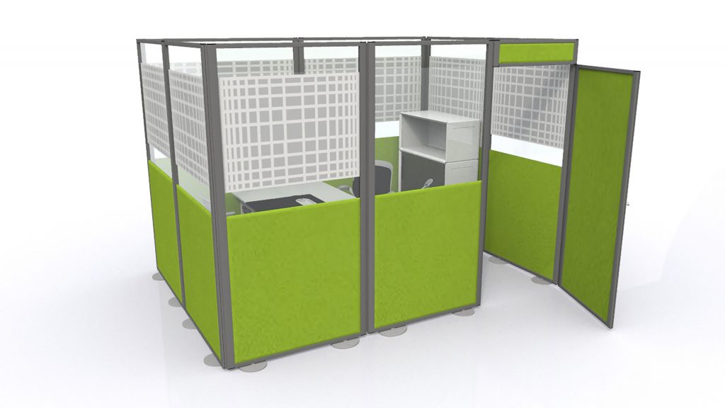
We discussed the office pod briefly before and to expand, it is increasingly being considered as a cornerstone of modern office design. Equipped with an innovative design, these can provide an additional layer of fluidity in an open office. Sometimes collaborative group work will need privacy and the freedom to express itself and the main office is no place to thrash out ideas or practice presentations. So, the office pod can become an adaptable space, separate from the office and acoustically equipped to cope with audible distractions.

Whether it is for group meetings or meetings with clients, an office pod can provide privacy for anyone without requiring a permanent room. Even for individual workers, the office pod is effective at providing peace and quiet when working to close deadlines. The traditional open office is renowned for becoming a cacophony of noise and distractions. Therefore, separating these groups enables creativity and innovation to flourish.

3. Conduct the Ideal Interview with an Office Pod

The clear majority of modern start-ups are incorporating these fluid concepts in their own designs. Nowadays, the design of your workplace has become a reflection of the company culture as a whole. Blanket white tones and a rigid layout set a more serious tone. Meanwhile, floods of colour and savvy technology strike resemble a more positive and relaxed company. For many of these start-ups, the goal is to attract the newer generations. Ideally, those with fresh ideas and a firm handle on whatever social media is. Even at the interview stage for prospective employees, a candidate is often assessed for how well they could fit in with the team.

Turn up for an interview at a ‘fun’ company wearing a suit and you may actually risk costing yourself the job as you do not fit in with the culture they are trying to achieve. Once again, it is no longer the bottom line (CV) which seals the deal, but the characteristics which make you human. In terms of office design, an office pod provides an ideal environment for such interviews to take place. Separate from the main office, yet with an insight into how things operate, this is designed to provide flexibility. As the business grows with new employees, should you need the space again, the office pod can be packed away or simply moved.

4. Learning without Distractions

As one of the main features of the office pod is its ability to create private space, this means that its usefulness extends outside of the office. To be specific, when learning is taking place, whether that is of children in school or new employees, creating the right conditions will help to provide them with a head start. In an office, you may be fortunate enough to use headphones. However, without a block on external distractions, the distractions caused by open plan layouts will undermine the learning process.

Considering initial training will almost always be the first thing a new employee does, it is still important for you to make a good impression as a business. Simply throwing them on a spare desk and leaving them to their own devices hardly strikes of a considerate business. Employee expectations for working conditions continue to grow in tandem with evolving office design. Therefore, as competitors continue to adapt, failure to do so makes your business a less attractive proposition to potential candidates.
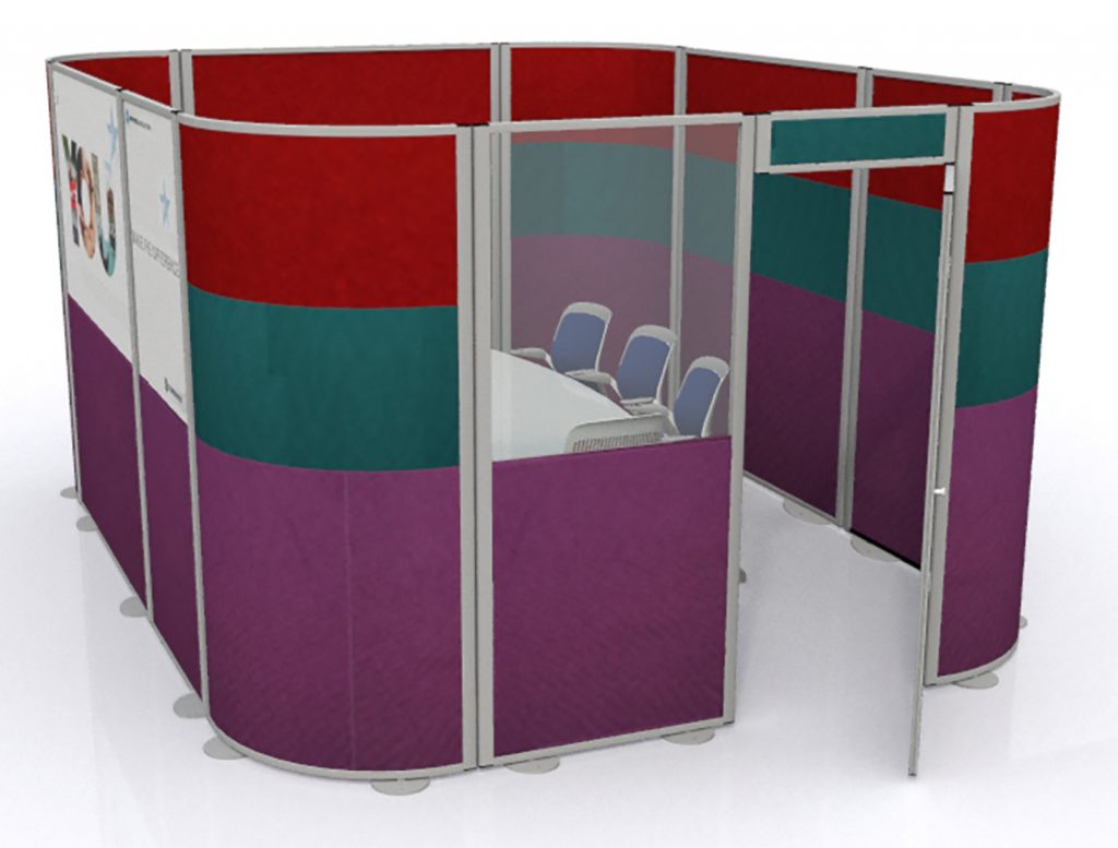
Office Pod
Acoustic Office Pod

The office pod is a key innovation in modern office design. Here at Rap Industries, we have manufactured office partitioning and exhibition stands for over 40 years. Throughout this time, our products and designs have adapted to meet the evolving requirements of our clients. To find out more about the office pod as well as our other products, please get in touch. To do so, either call 01733 394941 or send an e-mail to sales@rapind.com.
Categories
2017 Blogs

The History of Open Office Design: Inspiring the Future

The Cubicle was Inherently Flawed, But the Future is Bright for Office Workers

When office workers sit at work like drones, churning away at a computer which grumbles whilst trying to run Excel in tandem with a web browser, it’s rare they take a moment to absorb their surroundings. The office is synonymous with clocking in at 8:58, sitting at a desk and staring longingly at the clock as it ticks towards twelve ‘o’ clock. It’s generally perceived the life of the office worker is full of misery, brightened once a year when Christmas is a few weeks away. Why this is the case is surprisingly easy to track, but the designers of the open office never intended it to be this way. Feel like a walking zombie when you walk into the office? Yeah, you can thank corporate suits for that.

The layout which adorns the vast majority of offices worldwide is 52 years old in 2017. The ‘Action Office Plan II’ as it was known back then has been so successful, that it has only undergone a few minor tweaks and changes since. We’ll get onto why the second iteration was such a longstanding success, whilst its predecessor barely got a sniff. To put things into perspective, George Nelson, one of the designers who assisted in the design of the action office, reflected on the creation. Simply put, the action open office design was “for employees, for personnel, corporate zombies, the walking dear, the silent majority. A large market.”

How the Cubicle was Born and How it Set Out to Revolutionise Open Office Design

The open plan office has been around since architect, Frank Lloyd Wright designed the Larkin Administration Building in New York, in 1906. Its design took inspiration from factories of the time by incorporating as few walls as possible. Workers would sit in lines of desks, surrounded by their managers. The idea being there was a constant figment in their mind they were being watched. For sixty years, office workers were merely seen as cogs in the machine. If the cog does not work efficiently, the bosses at the top simply pop out the ineffective part and replace it with one which does work. The concept of humanisation was hardly popular at the time.

George Nelson and Robert Propst finalised the designs for the ‘Action Office I’ in 1964. The result was a combination of their theories of how the office should operate. This design was the first to consider that flexibility and freedom might have some place in the office. It was well known at the time that Nelson and Propst rarely saw eye-to-eye. However, they collaborated to create an office which would promote productivity, privacy and health. Unfortunately, these factors come at the cost of space efficiency and the ever-important tipping point; money.

Early reviews raved about this modernist approach to open office design. It was supposed to mean liberation for workers who were trapped in their classroom style layouts. However, for corporate managers, even during a period of economic boom, the revolutionary design simply was not worth the outlay. As offices grew, they wanted a design which would cram them in tighter. Nelson was removed from the project after refusing to accept this, but Propst finished the product. What became known as ‘Action Office II’ would forever burden him with the tag as the ‘Father of the Cubicle’.

How Open Office Design is Changing in 2017 and How Those Ideals Are Finally Being Realised

The Action Office II sacrificed style for sustenance. While Propst managed to incorporate privacy and adaptability into the design, it’s unlikely he realised the human cost. Corporate managers loved it, cram them in like cattle, cut the cost over a long period, with the only offset being that they must give employees a bit of privacy. So here we are today, victims of a demand for a ‘cubicle farm’. The Action Office was conceived to help people enjoy the office environment, rather than being racked by stress, anxiety and depression which the mundane nature of the work often induced. While the design was certainly a great solution for corporate bosses, both Nelson and Probst knew that it failed to achieve what they set out to create.

52 years on and there may be light at the end of the tunnel for white-collar workers. Led by start-ups and forward thinking businesses, the new generation of corporate bosses are beginning to realise the value of developing a happy and healthy workforce. While it is elementary now, it is baffling that for nearly 100 years, nobody latched on to the idea that keeping people happy and healthy would lead to better results, more efficient results and increasingly innovative results. Who knew that treating employees like humans would lead to a more productive business, boosting the flow of money into a business’ coffers?

How the Office Pod is One of the Key Tools in Realising These Ideals…

Courtesy of new technology, modern open office design is finally starting to achieve the ideals of freedom and flexibility which the Action Office never could. Being anchored to a desk is becoming a thing of the past. Rather than all employees being clumped into a large cattle-grid, offices are now being laid out into ‘neighbourhoods’, keeping relevant groups together. For noisy group work, separate spaces are even being created to maintain harmony in the wider office. It all sounds so simple, but the effect it can have is substantial.

Acoustic screens, adjustable desks, ergonomic chairs, the office pod and glass walls, all just a snapshot of modern furnishings. 50 years ago, office furniture was manufactured to be cheap and needed replacing every few years. Now, quality is at the heart of modern designs and they are produced with the future in mind. Rather than being viewed as a constant outlay every few years, businesses are now realising the value of designing offices as an investment. With adaptability at the core of the design, the office can flex and grow in tandem with the business.

Open Office Design Innovations
Office Pod

At Rap Industries, we have manufactured office partitioning to meet client’s demands for over 40 years. During this period, we’ve seen the market shift and all of our current products are designed with this mind. For many information on the products we produce, please get in touch. Either send an e-mail to sales@rapind.com or give us a call on 01733 394941.

Categories
2016 Blogs

Behind the Design: Practical Solutions for Modern Offices

Harnessing Office Design to Boost Productivity in the New Year

The office. The environment that millions of Britons (and many more worldwide) get to endure and enjoy for at least eight hours a day, five days of the week. The office, witness to drama, despair and elation and the setting which a few of us love but the clear majority of us outright hate. The office design which featured in the satirical television series of the same name is a stereotypical yet in most cases, genuine representation of how our own four-walled offices appear. Whitewashed walls, cubicle-styled desks and tapping, endless and monotonous tapping on keyboards. Work can become stressful and frustrating, but this ebbs and flows. But the office seemingly never changes, the same frustrations emerge and grow every day, slowly chipping away at the productivity, creativity and probably sanity of everyone who works within one.

Fortunately, modern start-ups and design companies in particular are taking the lead in creating offices which are tailored to actually help and encourage people to work. These designs take inspiration from when we design our own homes; everything from the colour of the walls right down to the fine details are selected by us and carefully tuned to make the space as comfortable as possible. Traditionally, the idea was that we should be setting up our desks with little treats from home to help ‘re-create’ that feeling, but ultimately it just made us hate the office more as we realise what we are missing out on. But modern office design is evolving that theory. Modern offices are increasingly adapting to the needs of their employees, setting up spaces and surroundings which create comfort and eliminate distractions which help people to focus.

The Cubicle is Dead, Long Live the Cubicle

Simply searching for office design will reveal some pretty crazy designs, but there is logic behind the madness. Admittedly, many smaller businesses cannot accommodate the lucrative costs of some of the professional designers used, but the practical elements behind some of the design decisions can be employed in any environment. One of the most striking features of modern office design is that the cubicle design is gone (sort of). Desks are no longer tightly knit together is small clusters on this basis of collaboration. Instead, we are now being taught to make the most of the space which we have available. With the advent of computers, there is no need for filling rooms and hulking filing cabinets anymore, so additional space is opening to allow people to spread out and create the areas they need.

The actual size of your office will play a part in this and while adapting is often the case, a small and compact office size could become a permanent hindrance on productivity. Reason being that small areas amplify small niggles. Noisy colleagues can be easily blocked out if you are sat 15 yards away. However, if they are a foot away, their pet peeves can be inescapable, further escalating stress levels and reducing your effectiveness. Furthermore, small offices suffer from acoustic issues, especially when multiple people are cramped inside. The rattle of keyboards in use, telephone calls escalating in volume as everyone tries to talk over each other and general chit chat are all emphasised, leading to distractions and the loss of valuable minutes and hours in the day.

Clever Use of Colour and the Hidden Benefits

The layout of the office makes the most significant visual impact on anyone who walks into the space. However, when you are sat in such an environment for multiple hours every day, you start to pick up on all of the fine details at hand. In traditional designs, you begin to pick up on how dull and dreary the colour scheme is as well quickly discovering how rigid and depressing the whole environment can be. The aim of the modern office design should be to change this perception. Colours when used in moderation can boost an office both visually but also psychologically for the employees. Bright colours promote happiness and calmness, while intense shades such as reds are designed to motivate and get people fired up about what they are doing.

One of the tactics employed at Google is the idea that the office should constantly change. Every week, seating areas would be re-arranged, promoting the concept that the nature of the work they do is constantly changing and therefore their staff should be constantly prepared for this. Now, admittedly this is probably unattainable with a static office space, but the idea that things need to be constantly changing is something that we can all learn from. The best way of doing this, is through nature. Flowers, plants and more tap into the pastoral part of our mind, they develop and grow alongside the employees which mirrors the development which you will be hoping for within your business.

Office Design Should Be Tailored to Your Company as Well As The People Within It

Finding a practical solution for your office can actually be very simple. On a one-to-one basis, find out from your employees what makes them tick, how they like to work and what really gets on their nerves about the office design. If your design team is struggling to concentrate with noisy neighbours, then it is time to consider giving them the privacy as well as the resources to be as creative as possible. Drab, noisy and distracting environments stifle productivity, decrease the wellbeing of your employees and ultimately harm your business.

Gauge what colours they would like to see, the kind of layout they wish to work in and the finer details which they believe can improve their working environment. An office design should be dynamic and in turn, provide space for your business to grow, but it is important to remember that over stuffing the space can and will cause considerable issues in the future.

Rap Industries have been designing and manufacturing office furniture for over 40 years. We take great pride in applying the feedback of our clients in all of our new furniture designs. With office screens, room dividers and acoustic pods available, we have a wide range on offer to enhance your office. For more information, please call 01733 394941 or send an e-mail to sales@rapind.com.

Office Design


Notice: ob_end_flush(): Failed to send buffer of zlib output compression (0) in /home/godispla/public_html/rapind.com/blog/wp-includes/functions.php on line 5427