Categories
2017 Blogs

4 Ways of Creating Stunning Notice Boards and Bulletin Boards

Getting the Message Across in a Digital World

In the world of smartphones, Bluetooth headsets and tablet computers, getting a message across is an escalating challenge for marketers and businesses. Our connection to the internet means we are being bombarded by notifications throughout the day. Whether this is via our phone or e-mail inbox, we are often trapped in a perennial cycle of people trying to nudge us towards using or buying their products. So, when it comes to getting the message across, we are going to have to be creative and be unique.

Even though technology is sown into the very fabric of our lives, there is still great marketing value in notice boards. Yes, essentially those large tack boards which were a familiar addition to every classroom, ever.  Admittedly, the design has evolved since those days, but their core function remains very effective in public places. Whether this is in offices, reception areas, hotels and more, their purpose is to grab a person’s attention for just a few seconds. Great design and an eye-catching message are crucial for this, which is why we’ve looked at how to make your notice boards a success.

1. Get a Creative Member of Your Team on Board

This will be your most important starting point. If you’ve not got an eye for design, then attempting to create visually enticing notice boards could end up being a waste of your time. Even if what you have to announce isn’t quite as exciting as the latest viral trend, it needs to be able to demand the attention of a passer-by. Then by corroborating their design skills with your ideas, it is possible to create stunning notice boards and bulletin boards.

When selecting colours, deciding on fonts and finalising images, ensure you keep the location of the notice board in mind. Lighting in the room, as well as its location, will all have an impact on how it should be designed. For example, if it is placed in a large reception area, then a small dull font is not even going to warrant a glance. From here, you can begin to put together a fluid design which is personalised to impress. Even for basic announcements, a creative design can make it much easier to read on the eye.

2. Plan Where the Notice Boards Will Be Placed

A common problem with wall-mounted notice boards is that they often fade into the background. If this is in a spot where people commonly just walk past, then even an eye-catching design will not get the message across. This is why free-standing notice boards can be a much more valuable addition. Examples such as Clippy Notice Boards enable notices and announcements to be placed in the eye-line of the target audience. So even if they are glued to the screen of their phone, your content will at least be in their peripheral vision as they walk past.

The combination of a free-standing notice board with eye-catching content will help to get the message across. Importantly, they are effective in minimising the space required, leaving the area with plenty of room to manoeuvre. On top of this, they are also easy to move, enabling them to be adjusted and re-positioned for greater effect. This ultimately allows the area to be dynamic and capable of adapting to different events and visitors, depending on what is required on the day.

3. Create a Theme and Stick To It

One of the major reasons why notice boards can become so ineffective is a lack of effort being put into the design. Often, they are used in locations where people are passing through or just spending a few minutes there. As such, if the design of the content is dull and bland, then what kind of encouragement is there to take note of the message? If the announcement has been knocked up in a few minutes on a Word document, then what does this say about the importance of the notice?

To narrow down time, we recommend creating a theme and sticking to it. Even if this means spending a little longer to develop a creative template, this can then be quickly adjusted as and when required. One of the potential options here is to incorporate corporate branding to encourage people to take notice. An official design such as this makes the message appear relevant to the business and therefore relevant to the reader. As well as this, it also keeps the design of the notice boards consistent with the existing environment.

4. Notice Boards Should Be Dynamic

This final point is situational depending on the location you have. For example, if you have a reception area, then it is likely that you will have different people passing daily, meaning there is little need to adjust the design. However, if for example, it is in an office, then it is crucial to modify it to keep it fresh. This not only shows that there are new announcements but will also encourage them to glance over every day.

Simple changes keep things relevant and also gets your target audience into the habit of checking for notice changes. Ultimately, notice boards do not have to and should not be boring. You only need look online for some of the amazing creations produced by teachers for example. These are tailored to get children and adolescents looking, which is often a challenge on its own.
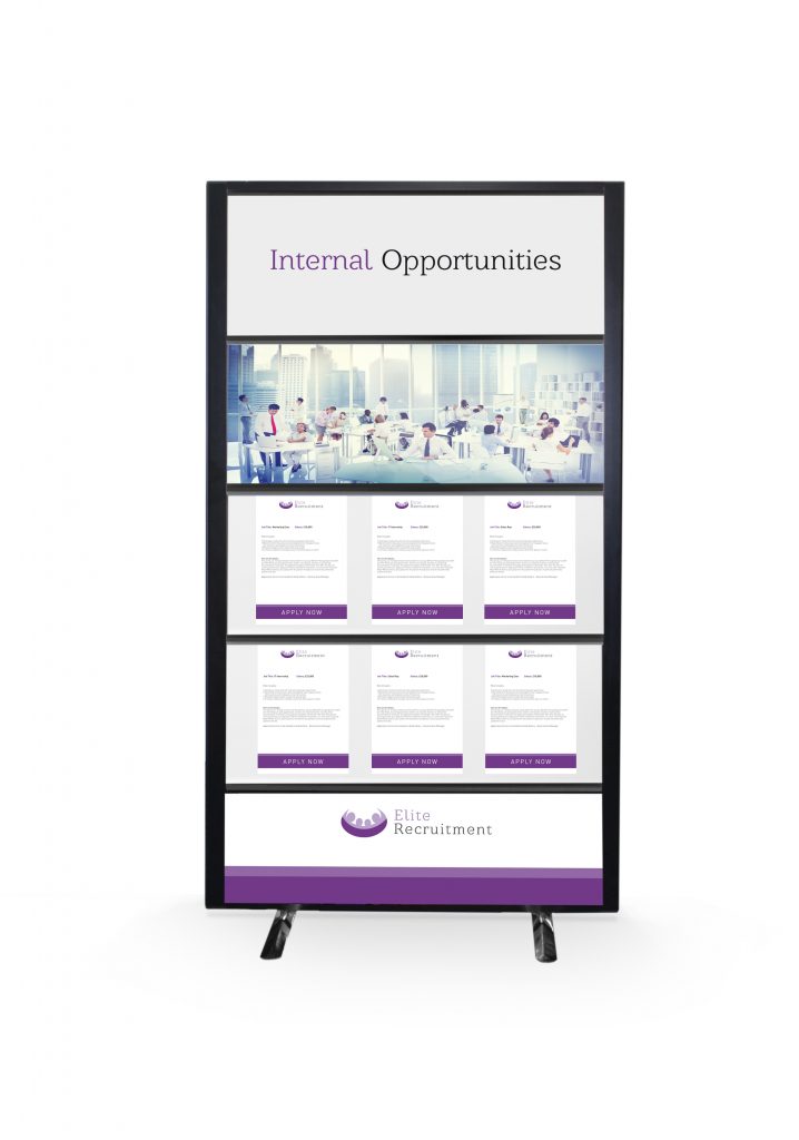
Clippy Notice Boards

Rap Industries are designers and manufacturers of notice boards and office partitions. By working with schools and businesses, we utilise their feedback to create products which are effective in their relevant environment. For more information on how we can help, please call 01733 394941 or send an e-mail to sales@rapind.com.

Categories
2017 Blogs

Modern Alternatives to the Pinnable Notice Board

Finding an Alternative to a Well-Worn Design

Notice boards hold a great deal of potential when it comes to displays. Their ability to be completely customised puts the creative look completely in your control. That said, the pinnable notice board still has its limitations. While the design is simple, a pinnable board will always cause permanent damage to the content you are adding. Furthermore, the clear majority of notice boards are wall-mounted. This is hardly an ideal position when so many people now have their eyes glued to their phones. A modern notice board is all about addressing these issues and ensuring that important messages and announcements stand out to their target audience.

As a small disclaimer, we are talking about notice boards in a business setting, where attracting attention is often more of a struggle. So, if you are tired of using traditional pinnable notice boards, then you are in the right place. They have consumed much of the market, so it is often to find any reasonable alternatives which are not going to cost you a ridiculous amount. As well as some of the more obvious alternatives, we’re also going to examine some more unique options which may be ideal for your environment.

Clippy Notice Board
Clippy Notice Board

1: The Emergence of the Free-Standing Notice Board

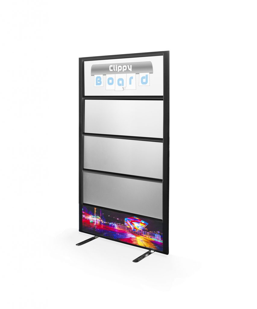
For busy environments, in particular, a wall-mounted notice board simply is not going to cut it. Often the content is too far away to be seen and often, it becomes an ignored background aspect. To address this, there are now free-standing notices boards. These are ideal to be set up in hallways and reception areas. Crucially, the information can then be seen clearly by all that are walking by. A unique example of this is the Clippy notice board. This modern notice board features an eye-catching design which allows content to be added via the grip rails. Not only does this prevent any damage to the content, but it is also quick and easy to use.

As a free-standing notice board, these are often the ideal addition when presenting important announcements and information. Their design is built around grabbing attention as people walk by. Then, assuming the content is clear and can be seen from a fair distance away, will convey the message even if passers-by are indulged in the screen of their mobile device. As a final caveat, they are also easy to move, ensuring they can be utilised in different areas or positions, depending on what is required.

2: Customisable and Magnetic Notice Boards

A recent trend which is growing in popularity is to opt for magnetic notice boards. Often, these double-up as a whiteboard or blackboard, offering a whole new level of creativity. While not suitable for long-form information, these excel when used to display brief updates to passers-by. Firstly, the customisable board can be easily changed and there is even room for some creative finesse when writing out the message.

Then, the inclusion of the magnetic board allows any leaflets or announcements to be conveniently added with just a few magnets. In terms of style, these offer much more than traditional pinnable notice boards. For example, a magnetic blackboard can be fantastic for more rustic environments or restaurants where snippets of information can be added and quickly changed when required. A common issue for pinnable notice boards is that their cheap price often inhibits the final design. As a result, this is a major contributor to them simply fading into the background and not fulfilling the purpose which they were purchased for.

3: Consider the Value of Digital Notice Boards

While the aforementioned options may provide a cost-effective solution, there is an option to help to really get the message across. Digital notice boards provide a unique way of displaying messages and announcements. While these are likely to stretch your budget further, they do offer the best way to display information. These electronic options often combine a low-end computer with a decent screen. For a bit extra, you can even get the two combined.

With this setup, it is possible to create interactive and enticing displays. With the introduction of the screen, it is possible to create static displays as well as using videos and animations to illustrate messages. The result is significantly more appealing to passers-by, which ultimately means a higher chance of communicating the message to the target audience.

Whatever the budget, there are now a wide variety of options available as an alternative to the traditional pinnable notice board. Often, the decision comes down to the setting. If you need a simple board just to be creative, then the pinnable is still the way to go. However, for more complex and busier environments, it is becoming increasingly necessary to have attractive visual tools to get the message across.

Clippy Notice Board
Rap Industries are manufacturers of notice boards, office partitions and acoustic pods. Our experiences over the past 40 years have moulded the design of our products today. For more information on how we can enhance your business environment, please get in touch. To do so, either call 01733 394941 or send an e-mail to sales@rapind.com

Notice: ob_end_flush(): Failed to send buffer of zlib output compression (0) in /home/godispla/public_html/rapind.com/blog/wp-includes/functions.php on line 5427