Colour has always been an instinct for humans and can be so subtle that thousands of years of our ancestors probably never realised it. In the primitive times of technology, simple aspects such as colour formed the very first kinds of communication, many of which are still prevalent today. Think about how you feel when sat by a river, as the water gently flows past you and the chaos of urban life slowly ebbs from your mind.
If you were to ask someone what they associate with blue, chances are they will instinctively say the sea. How about yellow? Sunshine, obviously. By creating such an intrinsic link, you could then ask someone how they feel when they think of the colour blue? I would wager there is a reliable probability they will say it evokes the feeling of calmness and serenity we normally associate with flowing water.
However, it has only been in recent times where we have begun to realise how our passive understanding of colours can be used to maximise productivity and happiness. While many of us will decorate our home to our tastes, the concept of customising the workspace is very much a recent theory. In the past, the workplace has been the beacon of professionalism and efficiency, environments which were designed to maximise proficiency by resembling factories. Unsurprisingly, humans are not quite as straightforward as machines, and white, beige and dull grey walls only serve to increase stress levels and lead to more absenteeism.
Now in modern times, the workplace is become increasingly diversified as many seek to create spaces which represent their brand. A key proponent behind this is the use of colour and many of the colours found in a company’s logo are increasingly being transferred across to the office. Have you ever taken a moment to consider why major brands use the colours they do in their iconic logos? BP makes the most of green and yellow to present an image of health and growth, Apple solely uses neutral colours to promote the idea of calm and cleanliness, meanwhile Virgin uses a bright red to emphasise its boldness.
The same can be applied in the office, whether it is on the paint on the walls, the colour of the floor, or the colours of partition screens. Creative departments are increasingly surrounded by yellows and purples to encourage creativity and imagination, meanwhile financial departments utilise greens and blues to promote calmness and serenity. There is a huge variety of colours available which passively lead our minds astray and encouraging emotions which we would not otherwise have had.
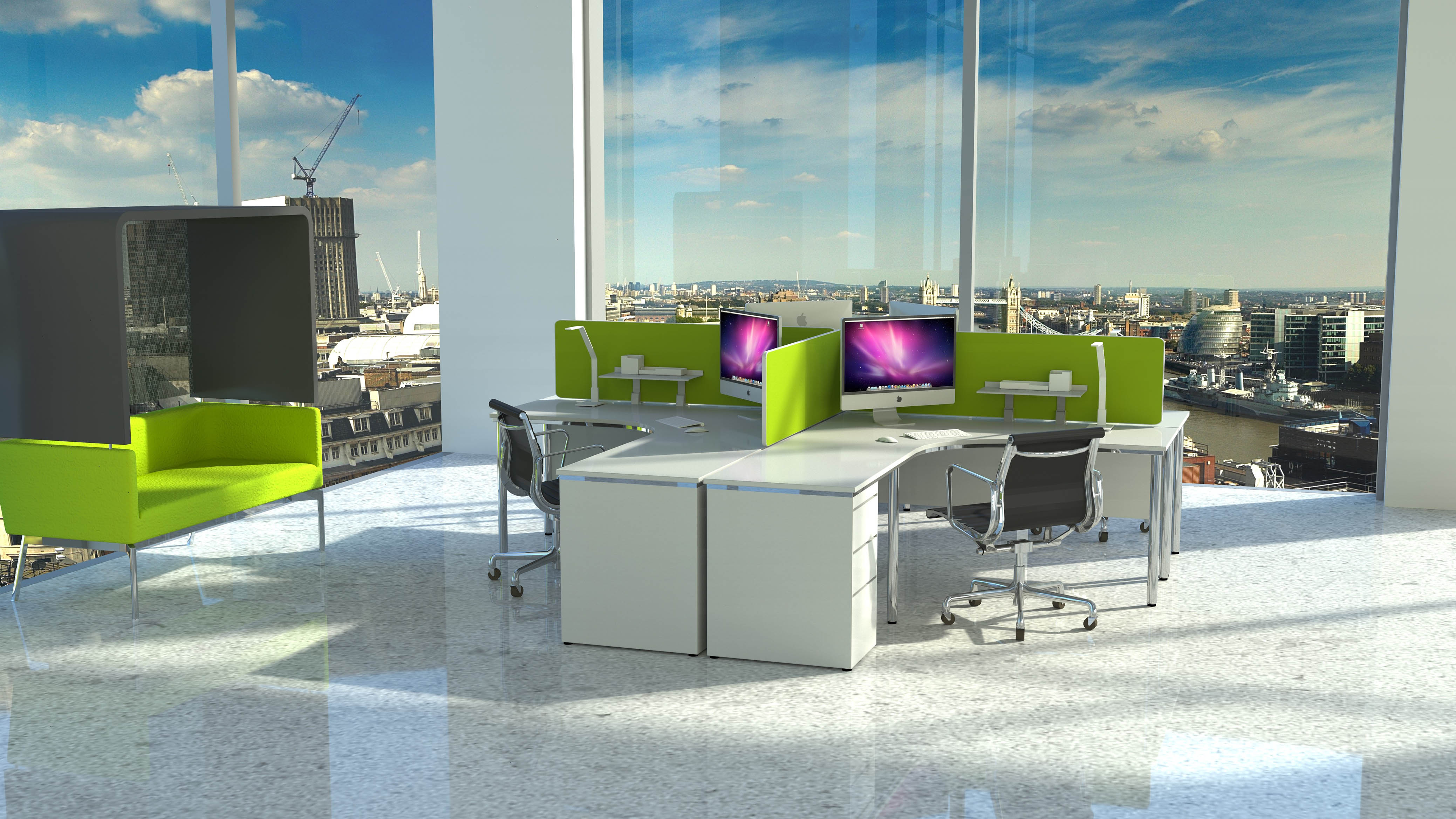
In open offices, it is best to avoid huge colour clashes for aesthetic purposes, which is why it is becoming increasingly popular to utilise vibrant partition screens to accent various departments with relevant colours. This allows the walls to be blanketed with a universal brand colour, meanwhile, closer personalisation can be applied through the use of partition screens. The Delta Acoustic Partition Screens are perfect for this kind of environment as they incorporate a modern design with 20 different Fizz fabric colours.
If morale is beginning to dip, or absenteeism is steadily beginning to rise, then consider a re-design of the office. Not only does the process encourage a degree of excitement, it can become symbolic for a fresh start, one in which you can create a more enjoyable working environment for employees and help to project your brand values through them. If you would like to learn more about how Delta Acoustic Screens can help you to achieve this, then please give us a call on 01733 394941 or send an e-mail to sales@rapind.com
