Warning: Undefined variable $has_ut in /home/godispla/public_html/rapind.com/blog/wp-content/plugins/seo-wordpress/seo-metabox-class.php on line 308 Skip to the content
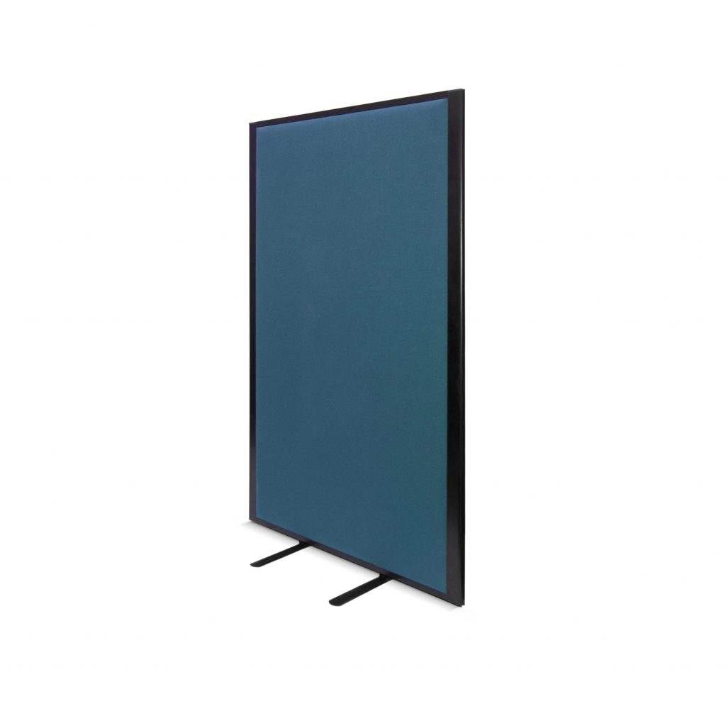
Freestanding, portable, acoustic, dry wipe, printed – and that’s just to name a few. Open plan offices and floor spaces were a thing, but it seems we’re coming back around to sectioned offices and privacy compartments.
Each company or office will have their own idea of what works and what doesn’t, some love open plan and some love a good office partition. Both are available to you, adding partitions to an office, doesn’t mean you have to close everything off and shut yourself away. With a range of different solutions, a lot can be achieved, let us show you how…
Acoustic Screens
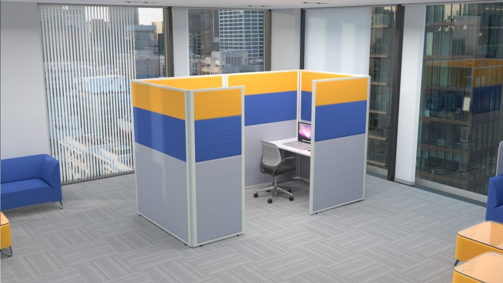
Perfect for a loud office and helps reduce the hustle and bustle of a busy environment. These screens have a foam interior to absorb the unwanted to noise to keep productivity high and distractions at a minimum. Not only helping with the noise but providing each department with a little more privacy, to get heads down and stuck in to their work load.
Pinnable Screens
Resembling the same exterior as a general partition, and still looking great in the office with your chosen fabric. The core has been created to accept pins, so you can go ahead and attach your information, photos and office notices. The finished product is a 2 in 1, a partition and notice board. Afterall, we all love a dual-purpose product!
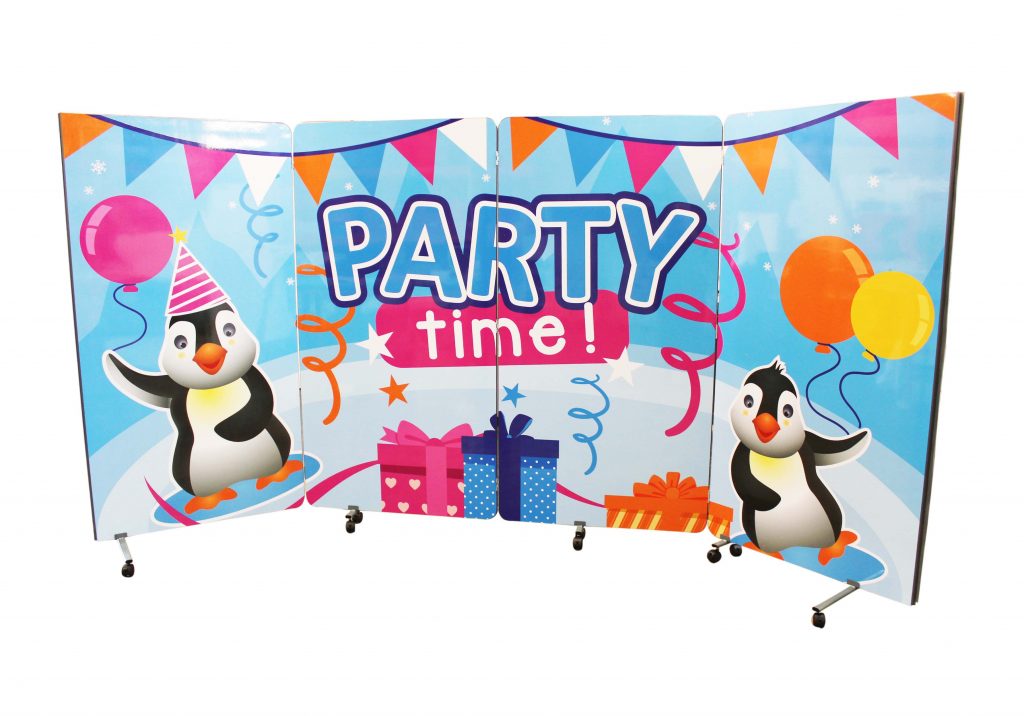
Printed Partitions
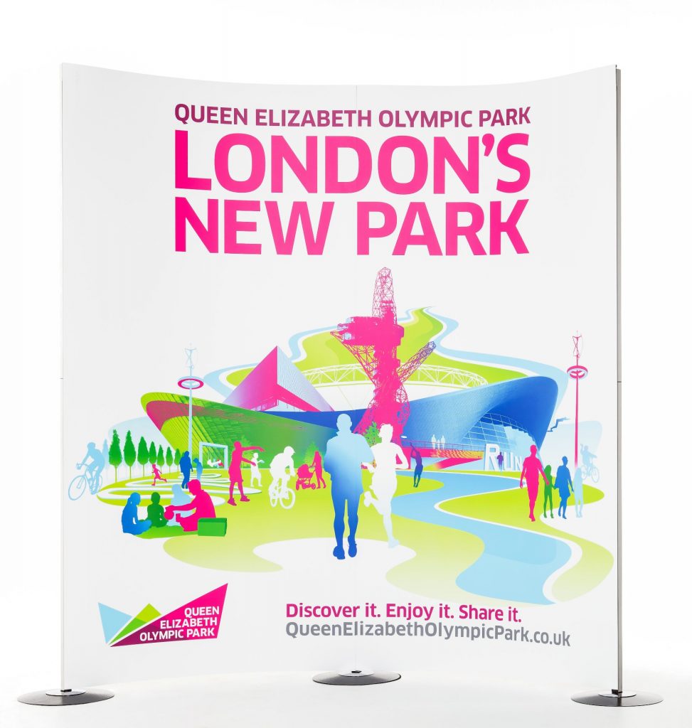
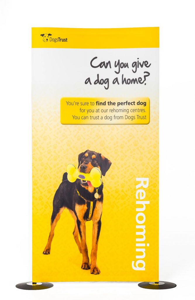
This is where the fun begins. A printed screen is basically a blank canvas and can be designed with anything and everything you desire. Add a splash of bold colour and interesting artwork to flow through the office and bring the personalities alive. Any artwork added is completely custom, you can add any colour, logo or image to create a unique partition.
Vision Partitions
A partition mix up – A partition with a window! Sounds great, right? Offering you the noise barrier you may require as well as making the most of the natural day light and keeping the office bright. A great solution if your vision is a 50/50 office, providing a great compromise between open plan and closed spaces.
An added benefit is you have the choice of acoustic to vision ratio!
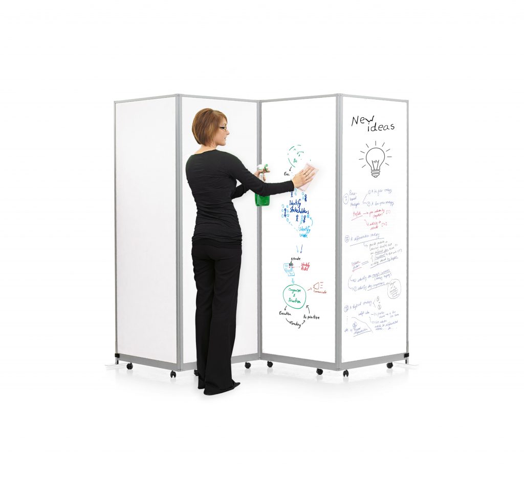
Dry Wipe Screens
Doodle as you work or make important notes – either is fine with us! Another dual-purpose product, this is suitable for closing off an area or if you require a portable solution for training, the dry wipe screen can work wonders. Wheel in and out when required – lock the castors in place when in situ and the notes made can be transferred around the office or left in place for the next session.
Hopefully you now have a good foundation to start your research. Think about style, budget and how you will use the screen – let the shopping commence!
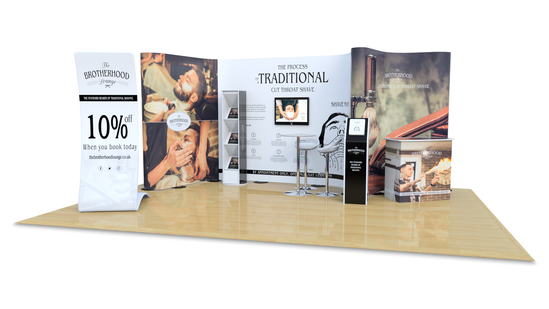
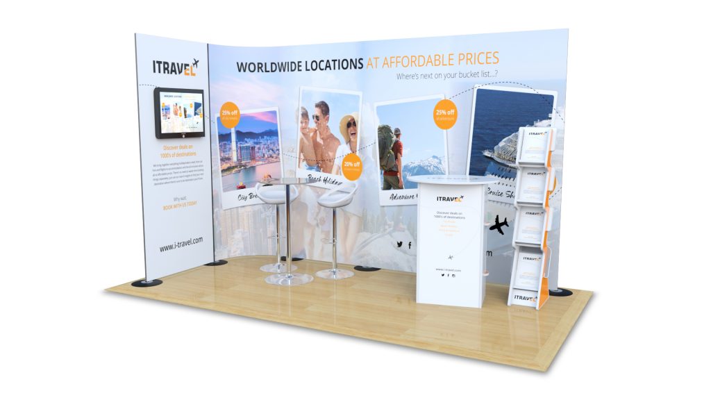
As 2019 unravels, new exhibition designs and stands are being advertised and promoted to grab some attention and show you what’s new and in trend.
Pop ups and modular displays are the little black dress of the exhibition world – never goes out of fashion and will save you when nothing else works. But sometimes it’s okay to venture outside of your comfort zone and try something new – who knows, you might just love it!
If you haven’t already heard, here’s what you need to know :-
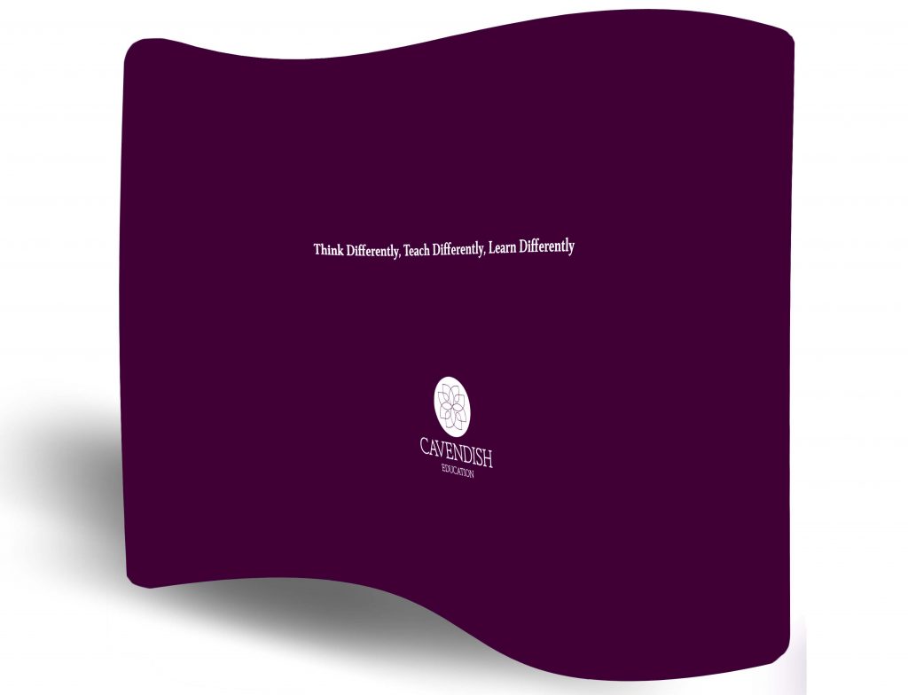
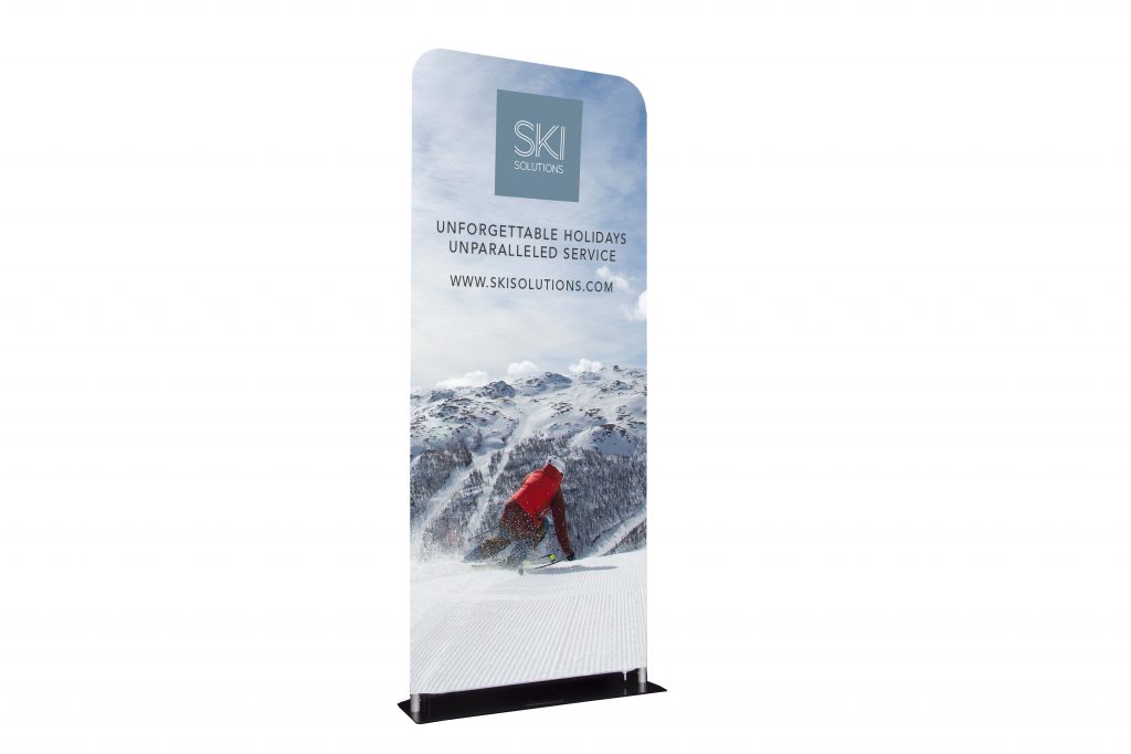
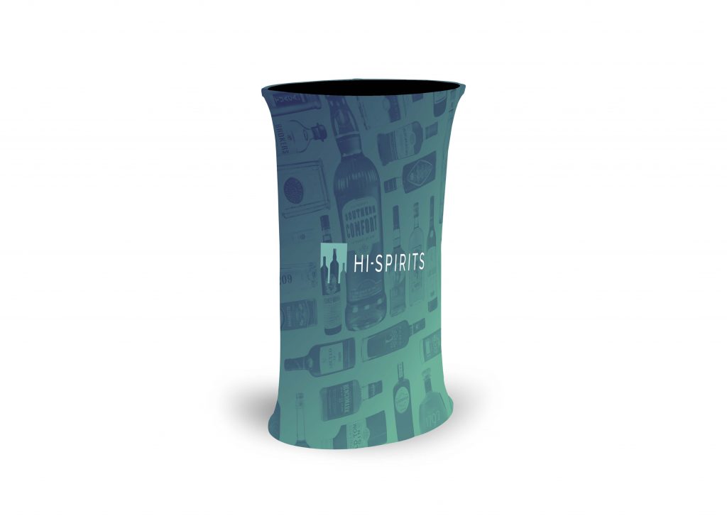
A fabric exhibition display with an internal metal structure which creates the shape and main body of the stand. Your chosen graphic will be printed on to a stretch fabric which fits over the structure like a glove and zips at the side to complete the look.
The overall finish shows a seamless canvas with a double-sided print on most options. Providing you with double the artwork and double the advertising room – which is always an upside.
This begs the question why should you choose a fabric display?
We say – Why not? With the exhibition stand market always growing with new solutions and options, it pays to try something new and hit your target audience with a new vision. Change keeps things new, fresh and exciting.
A major factor is the seamless finished product, meaning your final design will have no joins and will show your artwork as 1 continuous design. Seen as an advantage by many to ensure the exhibition display is flawless, neat and paints the perfect message.
With a range of fabric displays from stands, pop ups, arches, booths and banners, your stand will never end. Thinking ahead is the aim of the game and you always want to adapt, change and add items to your stand, another thing which is made easy by the fabric options available to you.
As the saying goes, New Year, New you. But this year it sounds to us more like New year, new display – and what we mean is a new year is the best time to refresh your displays and get you set for the year ahead.
Starting the year out on the right foot is important especially when it comes to your yearly shows and events. It’s time to upgrade, refresh or completely restyle your display boards with a brand new look.
Just like printed displays you’ll be spoilt for choice which makes the decision process harder than ever, we’ll break it down for you with facts and features – Now let’s get the ball rolling…
Folding Display Boards
A light, compact and simple system. Perfect for a low traffic area and requires minimal assembly, meaning you can be up and running in a matter of minutes.
The display folds away nice and neatly and can be carried away in a padded storage bag. Just because the folding display offers a simple design, this doesn’t mean the colour has to be – choose from an array of fabrics to brighten up your display. Additional to this choose a pinnable or loop nylon fabric- another option to make the choice that much harder.
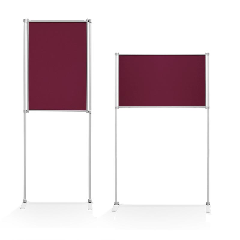
Panel and Pole Systems
The name says it all – a display system consisting of panels and poles!
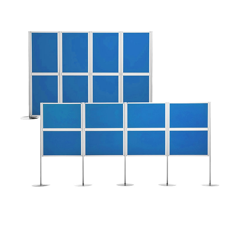
The beauty of this system is the flexibility, you can use as many panels as you need to create your vision. All you have to do is link them together and you’re good to go. The selection of small and large panels opens you up to a number of possibilities and makes the design great for each stand space or area you come across.
The boards are finished in a loop nylon fabric, allowing you to complete your display with posters, photos or new product information.
Build your own
Display board flexibility at its finest. The build your own option allows you to choose everything from your panel sizes, poles, headers and accessories. Finished in 1 of many loop nylon fabric colours or create your very own artwork for a complete custom printed panel or full display.
Building your own makes the display your own design and allows you to create a display perfect for you. Due to the unique design of the poles you have 4 hanging points for the boards so the shapes and configurations you can create are huge.
This should be enough to get you started – Let’s get creating!
The air is cooler, the nights are darker, some might be hoping for snow – all the more reason to bring out the jumpers and wrap up warm. As much as the season is enjoyed, its also filled with the dreaded cold and flu symptoms.
We use a concoction of syrups and remedies to keep us well enough to make it through the day. The feeling of a stuffy nose and head is a feeling we’d like to battle in bed, but that’s not always an option.
A cold can be caught in various places, we’ve listed the most likely places and more importantly some prevention tips.
Places most likely to catch a cold
Airports
Hundreds of flights coming in from all over the world, with hundreds and thousands of people coming in and out of the airport, along with suitcases being passed and handled by many.
As we paint the picture of an over crowded terminal, it’s no surprise to hear a cold could be caught on your way to a business trip or returning from an annual family holiday.
Office
You love your job and your colleagues, until they get ill and begin to cough and splutter near you. Moving your desk isn’t an option, so for now you’ll have to pray you won’t get sick.
Doctors waiting room
When have you ever been to the doctors because you feel great? The answer is never!
Naturally every visit to the doctors is because you are unwell or poorly in some way. A waiting room is swarming with germs and bacteria, not to mention the chairs, surfaces and toilets.
Public Transport
A bus, train or tram, all of them are tight confined spaces. Now fill that space with passengers and some with the cold or flu.
There’s no escaping – either for you or the germs.
Holding on the hand rails too? Many hands will have done the same and you may be picking up an unwanted bug.
How to prevent a cold?
It’s difficult to keep completely cold free as we are exposed to germs as part of our everyday life and sometimes we just can’t control or stop it. But we need to keep on top of our health and ensure we do what we can to fight back against the bugs.
It’s unrealistic to refrain from holding a door handle, turning a public toilet tap on or using the office mircowave but we can all make an effort to follow some top tips to prevent catching a cold.
Cold Busting Tips
Washing your hands
Hand Sanitiser (for when washing your hands isn’t a possibility)
People buy when they have a need for something and consumers buy from people they trust. Knowing what your audience want before they do is how you hook them, and having a great graphic design is one way you can connect with them. Create a graphic design that appeals to predictable human behaviour and you will have nailed it. But how do you do that?
Keep it simple.
Ensure your design is simple and familiar. We humans are visual beings, we make split second decisions based on what something looks like and if it doesn’t appeal, we walk away. Take advantage of evolution and make your design relatable, easy to understand.
You won’t be there to explain to each individual customer what it is you’re trying to sell, so allow your product to sell itself. A great graphic design can also instantly change the perception of a product from complex to user friendly.
Make your graphic design attention grabbing.
The average attention span online is five seconds. That’s it. You have five seconds to pique someone’s interest and persuade them to hang around, if not they’re off. A prime example of this are modern websites.
Look at how websites have changed over the years. You can still find older websites with wonderful examples of how not to do it – pages crammed full of information, a wall of text, inaccessible to all but the most ardent reader. People don’t have time for a barrage of words, simplicity is key.
A design has to be simple to navigate, scannable, easy on the eye and the brain, designed to draw you in and capture your attention at just the right place. Art has fast become science.
First impressions count.
Like anything in life you don’t get a second chance to make a great first impression, and no matter what we are told, we all (subconsciously or not) judge a book by its cover.
Don’t try and be avant garde with your graphic design. A pleasing visual, something clean and simple will appeal to more people, a complex one can put them off.
A picture paints a thousand words.
Communication is key to understanding and you don’t always have to use words to get your point across. If you can find a way to express what it is you are trying to convey without uttering a single word, you have nailed your design. Take for example colour, colour is a powerful trigger for evoking an emotional response: the colour red has been deeply ingrained in our psyche to mean danger, green implies an organic quality and babybird blue is the colour of trust.
Appeal to people’s emotions.
Make sure your graphic design has a visceral effect on those viewing it. Have it tug at their gut, create an instant connection, make them love it but not know why. This can be as simple as a beautiful photograph or a striking use of imagery or simply a combination of colours that are visually appealing to the audience.
The cost of exhibiting for any business, not just a start-up, can be astronomical, so you will want to box clever and only participate in those exhibitions that truly work for you and your business.
Exhibiting as a start-up is most definitely worth it when you realise you are quite literally shooting fish in a barrel, they are a marketing dream come true. Presenting your start-up at an exhibition gets your business in front of a captive audience who are there solely to find businesses just like yours.
Where do you uncover the best exhibitions for your start-up? Look no further, as we have listed the top 5 UK exhibitions for start-ups below.
This is the UK’s leading industry showcase of fine food and drink. This exhibition puts your food business directly in front of a high quality audience of top buyers looking to source the very best in food and drink. Not only do you get to present your business, but you will be in great company, standing shoulder to shoulder with people in a similar situation to you. You can discover the latest trends, see whose products have been awarded Great Taste stars and even enter the Seed Fund start-up pitch competition.
With visionary speakers to inspire you, the world’s media to cover you, buyers to charm and consumers to sell to, this is the one stop shop for your tech start-up. This exhibition is the largest business and prosumer show in the UK. Network, create partnerships, build your supply chain, discover the latest tech gadgets and wearables, whatever you do, don’t miss it.
Wellness start-ups
For those in the health and fitness arena there is a wealth of wellness exhibitions all around the UK for you to showcase your wellness start-up at. The SFN expo in Glasgow’s SEC is the inspirational health and fitness weekend of the year. This high energy exhibition is ideal for you to meet inspirational people in the wellness world, attend live events, meet your fellow brands, but ultimately put your start-up in front of thousands of consumers and trade buyers alike.
The go-to show for anyone starting or growing their business. Listen to the UK’s leading business experts divulge their secrets, expose your business to an audience of over 25,000 other businesses and take the opportunity to sell your business and services to these highly targeted consumers. You can also take part in 170 interactive training sessions or pitch to panels of multi-millionaire investors.
Whether your business is soft furnishing production or a complete interior design service, positioning your start-up business in front of a captive audience is key to growing sales. The Ideal Home Show is the UK’s most iconic and trusted home exhibition, celebrating its 110th year this year. Generate sales, launch new products, promote your brand or network with industry key players. This is not one to miss.
Everything we do as humans is viewed through the lens of psychology, and it’s not subtle either. You won’t have to go far to find examples of this in action: Reality TV behemoth Big Brother frequently invites behavioural psychologists to analyse the actions and interactions of the people living under the microscope, as it were.
While this use of psychology serves a very entertainment-driven focus, businesses and brands have been using psychological factors to direct a lot of their decisions for a long time. You don’t have to have a degree in social sciences to use some of these tactics to motivate your staff, we’ve many years experience in both design and production of office screening and we want to share 3 killer concepts that will definitely boost productivity.
Consider your colours
There’s more than a few idioms we use that involve colour. Seeing red, feeling blue, green with envy. Colour is commonly associated with specific feelings, and there’s been many studies that back up the notion that certain colours can evoke a certain response. Of course context matters, and we all perceive colour differently, but research seems to universally agree that red can represent power and strength, green depicts balance and calm, while yellow is commonly associated with optimism.
Use it: Want to spread a positive message? Make yellow a dominant colour in your office screens!
Shaping up
Everything is made up of a series of shapes, but when we hear the word it’s really common to just picture one or two based on geometry. Some of the most recognisable brands can have their logos analysed against the backdrop of shape psychology, and plenty of scientific research has validated this approach to design. For example, circles can be associated with wholeness and continuity, while triangles are often said to represent dynamism. Squares are the most commonly seen shapes and are commonly associated with feelings of strength and reliability.
Use it: Screening doesn’t have to be boring. If you want a more contemporary feel look at screens with more shape such as curved, wave or even a mixture of styles!
The Gestalt Principles
While this collection of theories goes back many years, it can still be defined as a relevant part of modernity. Gestalt principles examine how the human brain makes connections between visual elements. This can be either based on proximity, similarity, closure, continuation or figure/ground (the idea that in a visual there are some elements that the brain immediately sorts as ‘background’ and others that are pushed forward as the ‘figure’. These principles are used a lot in logo design and examples of it are plentiful.
Use it: Understanding that the brain could wrongfully group visual content together can be a useful tool in when designing your office layout.
Notice boards should be something which we can be proud of. The freedom to completely customise them is what has made them such a staple addition to so many environments over the years. Unfortunately, the pinnable style, which we have become so accustomed to is gradually becoming outdated. Although, notice boards still provide a necessary service, which means they need to adapt to modern public places. For example, they need increased flexibility, which is a key factor for adaptable workplaces, offices and reception areas.
This is where the Clippy Notice Board comes in. It enshrines simplicity and flexibility at the core of the design. It is easy to move, features a professional appearance and provides freedom to customise, making it a natural successor to pinnable notice boards. Below you can discover the thinking behind the design and how it has been tailored for a variety of modern environments. There are even comparisons throughout with the more traditional pinnable notice board to help when deciding between the two.
The Basics: Design
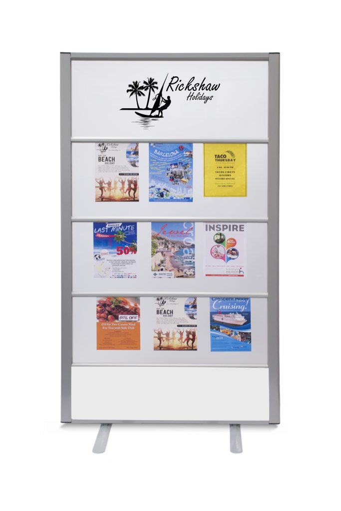
The design of the Clippy Notice Board was developed around what has made its pinnable counterpart so successful. To that end, it can be customised in a variety of ways of the grip strips. These allow posters, leaflets and any lightweight material to be added without sticking pinholes through all of them. While the linear design lacks some of the freedom which you may find with its predecessor, it more than makes up for it in other departments.
For example, one of the main benefits is that the Clippy Notice Board is free-standing. Within the design is a robust yet lightweight core, which ensures they are easy to move and can adapt to any space. In particular, this makes the Clippy Notice Board ideal in busy environments, where they can be re-positioned and placed in the optimal position to be noticed. For the hospitality sector as well as businesses, this can become extremely useful when directing guests to meeting rooms and function areas.
To compliment this, the appearance of the Clippy Notice Board is tailored to be more professional as well as easier on the eye. For example, the top and bottom panels of the notice board can be customised with high-quality graphic design to promote branding as well as highlight the key content of the board. The result is a display which is more structured and organised than the pinnable counterpart. This ensures it excels when grabbing the attention of passers-by.
The Benefits of the Clippy Notice Board
To expand on that earlier point about positioning – the location of the notice board is crucial for getting the message across. We can all dream of designing the perfect display, but if it is going to get shunted to the back of the room, then it is not going to get the attention it deserves. For pinnable notice boards, this is a common drawback as all too often they end up just fading into the background.
The combat this, the Clippy Notice Board is equipped with two free-standing feet, which allows it to be deployed in any open indoor area. This positioning when combined with a clear and concise design guarantee that attention is drawn towards the content, and therefore helps to deliver any notices and announcements.
The limited options to be creative may be seen as a drawback, but in fact, there is some solid reasoning behind this decision. By keeping the core of the design the same – structured and organised, this helps to make content easier to view on the eye. Often, many pinnable designs are overcrowded with hundreds of fantastic ideas which can unfortunately drown out many of the key points being made. With the Clippy Notice Board, the appearance is kept clear and concise, delivering messages and notices to their target audience.
The Clippy Notice Board is designed and manufactured by Rap Industries. We have been creating bespoke office partitioning and notice boards for over 40 years. Throughout that time, our designs have developed to meet the shifting needs of the modern workplace. For more information on this notice board as well as other products we manufacture, please call 01733 394941 or send an e-mail to sales@rapind.com.
In the world of smartphones, Bluetooth headsets and tablet computers, getting a message across is an escalating challenge for marketers and businesses. Our connection to the internet means we are being bombarded by notifications throughout the day. Whether this is via our phone or e-mail inbox, we are often trapped in a perennial cycle of people trying to nudge us towards using or buying their products. So, when it comes to getting the message across, we are going to have to be creative and be unique.
Even though technology is sown into the very fabric of our lives, there is still great marketing value in notice boards. Yes, essentially those large tack boards which were a familiar addition to every classroom, ever. Admittedly, the design has evolved since those days, but their core function remains very effective in public places. Whether this is in offices, reception areas, hotels and more, their purpose is to grab a person’s attention for just a few seconds. Great design and an eye-catching message are crucial for this, which is why we’ve looked at how to make your notice boards a success.
1. Get a Creative Member of Your Team on Board
This will be your most important starting point. If you’ve not got an eye for design, then attempting to create visually enticing notice boards could end up being a waste of your time. Even if what you have to announce isn’t quite as exciting as the latest viral trend, it needs to be able to demand the attention of a passer-by. Then by corroborating their design skills with your ideas, it is possible to create stunning notice boards and bulletin boards.
When selecting colours, deciding on fonts and finalising images, ensure you keep the location of the notice board in mind. Lighting in the room, as well as its location, will all have an impact on how it should be designed. For example, if it is placed in a large reception area, then a small dull font is not even going to warrant a glance. From here, you can begin to put together a fluid design which is personalised to impress. Even for basic announcements, a creative design can make it much easier to read on the eye.
2. Plan Where the Notice Boards Will Be Placed
A common problem with wall-mounted notice boards is that they often fade into the background. If this is in a spot where people commonly just walk past, then even an eye-catching design will not get the message across. This is why free-standing notice boards can be a much more valuable addition. Examples such as Clippy Notice Boards enable notices and announcements to be placed in the eye-line of the target audience. So even if they are glued to the screen of their phone, your content will at least be in their peripheral vision as they walk past.
The combination of a free-standing notice board with eye-catching content will help to get the message across. Importantly, they are effective in minimising the space required, leaving the area with plenty of room to manoeuvre. On top of this, they are also easy to move, enabling them to be adjusted and re-positioned for greater effect. This ultimately allows the area to be dynamic and capable of adapting to different events and visitors, depending on what is required on the day.
3. Create a Theme and Stick To It
One of the major reasons why notice boards can become so ineffective is a lack of effort being put into the design. Often, they are used in locations where people are passing through or just spending a few minutes there. As such, if the design of the content is dull and bland, then what kind of encouragement is there to take note of the message? If the announcement has been knocked up in a few minutes on a Word document, then what does this say about the importance of the notice?
To narrow down time, we recommend creating a theme and sticking to it. Even if this means spending a little longer to develop a creative template, this can then be quickly adjusted as and when required. One of the potential options here is to incorporate corporate branding to encourage people to take notice. An official design such as this makes the message appear relevant to the business and therefore relevant to the reader. As well as this, it also keeps the design of the notice boards consistent with the existing environment.
4. Notice Boards Should Be Dynamic
This final point is situational depending on the location you have. For example, if you have a reception area, then it is likely that you will have different people passing daily, meaning there is little need to adjust the design. However, if for example, it is in an office, then it is crucial to modify it to keep it fresh. This not only shows that there are new announcements but will also encourage them to glance over every day.
Simple changes keep things relevant and also gets your target audience into the habit of checking for notice changes. Ultimately, notice boards do not have to and should not be boring. You only need look online for some of the amazing creations produced by teachers for example. These are tailored to get children and adolescents looking, which is often a challenge on its own.
Rap Industries are designers and manufacturers of notice boards and office partitions. By working with schools and businesses, we utilise their feedback to create products which are effective in their relevant environment. For more information on how we can help, please call 01733 394941 or send an e-mail to sales@rapind.com.
Notice boards hold a great deal of potential when it comes to displays. Their ability to be completely customised puts the creative look completely in your control. That said, the pinnable notice board still has its limitations. While the design is simple, a pinnable board will always cause permanent damage to the content you are adding. Furthermore, the clear majority of notice boards are wall-mounted. This is hardly an ideal position when so many people now have their eyes glued to their phones. A modern notice board is all about addressing these issues and ensuring that important messages and announcements stand out to their target audience.
As a small disclaimer, we are talking about notice boards in a business setting, where attracting attention is often more of a struggle. So, if you are tired of using traditional pinnable notice boards, then you are in the right place. They have consumed much of the market, so it is often to find any reasonable alternatives which are not going to cost you a ridiculous amount. As well as some of the more obvious alternatives, we’re also going to examine some more unique options which may be ideal for your environment.
1: The Emergence of the Free-Standing Notice Board
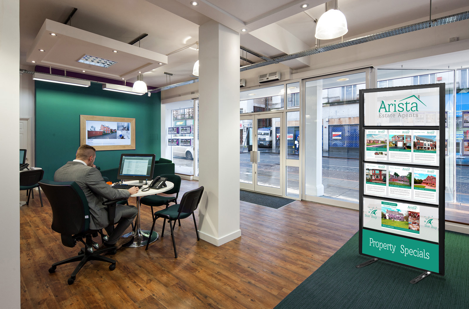
For busy environments, in particular, a wall-mounted notice board simply is not going to cut it. Often the content is too far away to be seen and often, it becomes an ignored background aspect. To address this, there are now free-standing notices boards. These are ideal to be set up in hallways and reception areas. Crucially, the information can then be seen clearly by all that are walking by. A unique example of this is the Clippy notice board. This modern notice board features an eye-catching design which allows content to be added via the grip rails. Not only does this prevent any damage to the content, but it is also quick and easy to use.
As a free-standing notice board, these are often the ideal addition when presenting important announcements and information. Their design is built around grabbing attention as people walk by. Then, assuming the content is clear and can be seen from a fair distance away, will convey the message even if passers-by are indulged in the screen of their mobile device. As a final caveat, they are also easy to move, ensuring they can be utilised in different areas or positions, depending on what is required.
2: Customisable and Magnetic Notice Boards
A recent trend which is growing in popularity is to opt for magnetic notice boards. Often, these double-up as a whiteboard or blackboard, offering a whole new level of creativity. While not suitable for long-form information, these excel when used to display brief updates to passers-by. Firstly, the customisable board can be easily changed and there is even room for some creative finesse when writing out the message.
Then, the inclusion of the magnetic board allows any leaflets or announcements to be conveniently added with just a few magnets. In terms of style, these offer much more than traditional pinnable notice boards. For example, a magnetic blackboard can be fantastic for more rustic environments or restaurants where snippets of information can be added and quickly changed when required. A common issue for pinnable notice boards is that their cheap price often inhibits the final design. As a result, this is a major contributor to them simply fading into the background and not fulfilling the purpose which they were purchased for.
3: Consider the Value of Digital Notice Boards
While the aforementioned options may provide a cost-effective solution, there is an option to help to really get the message across. Digital notice boards provide a unique way of displaying messages and announcements. While these are likely to stretch your budget further, they do offer the best way to display information. These electronic options often combine a low-end computer with a decent screen. For a bit extra, you can even get the two combined.
With this setup, it is possible to create interactive and enticing displays. With the introduction of the screen, it is possible to create static displays as well as using videos and animations to illustrate messages. The result is significantly more appealing to passers-by, which ultimately means a higher chance of communicating the message to the target audience.
Whatever the budget, there are now a wide variety of options available as an alternative to the traditional pinnable notice board. Often, the decision comes down to the setting. If you need a simple board just to be creative, then the pinnable is still the way to go. However, for more complex and busier environments, it is becoming increasingly necessary to have attractive visual tools to get the message across.