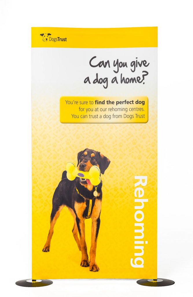
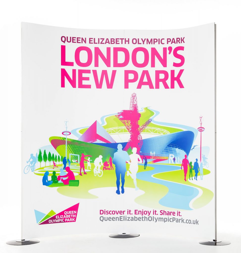
People buy when they have a need for something and consumers buy from people they trust. Knowing what your audience want before they do is how you hook them, and having a great graphic design is one way you can connect with them. Create a graphic design that appeals to predictable human behaviour and you will have nailed it. But how do you do that?
Keep it simple.
Ensure your design is simple and familiar. We humans are visual beings, we make split second decisions based on what something looks like and if it doesn’t appeal, we walk away. Take advantage of evolution and make your design relatable, easy to understand.
You won’t be there to explain to each individual customer what it is you’re trying to sell, so allow your product to sell itself. A great graphic design can also instantly change the perception of a product from complex to user friendly.
Make your graphic design attention grabbing.
The average attention span online is five seconds. That’s it. You have five seconds to pique someone’s interest and persuade them to hang around, if not they’re off. A prime example of this are modern websites.
Look at how websites have changed over the years. You can still find older websites with wonderful examples of how not to do it – pages crammed full of information, a wall of text, inaccessible to all but the most ardent reader. People don’t have time for a barrage of words, simplicity is key.
A design has to be simple to navigate, scannable, easy on the eye and the brain, designed to draw you in and capture your attention at just the right place. Art has fast become science.

First impressions count.
Like anything in life you don’t get a second chance to make a great first impression, and no matter what we are told, we all (subconsciously or not) judge a book by its cover.
Don’t try and be avant garde with your graphic design. A pleasing visual, something clean and simple will appeal to more people, a complex one can put them off.
A picture paints a thousand words.
Communication is key to understanding and you don’t always have to use words to get your point across. If you can find a way to express what it is you are trying to convey without uttering a single word, you have nailed your design. Take for example colour, colour is a powerful trigger for evoking an emotional response: the colour red has been deeply ingrained in our psyche to mean danger, green implies an organic quality and babybird blue is the colour of trust.
Appeal to people’s emotions.
Make sure your graphic design has a visceral effect on those viewing it. Have it tug at their gut, create an instant connection, make them love it but not know why. This can be as simple as a beautiful photograph or a striking use of imagery or simply a combination of colours that are visually appealing to the audience.


