Categories
2018 Blogs

Places you’ll most likely catch a cold and some flu fighting tips

December – what a wonderful time of year!

The air is cooler, the nights are darker, some might be hoping for snow – all the more reason to bring out the jumpers and wrap up warm. As much as the season is enjoyed, its also filled with the dreaded cold and flu symptoms.

We use a concoction of syrups and remedies to keep us well enough to make it through the day. The feeling of a stuffy nose and head is a feeling we’d like to battle in bed, but that’s not always an option.

A cold can be caught in various places, we’ve listed the most likely places and more importantly some prevention tips.

Places most likely to catch a cold

Airports

Hundreds of flights coming in from all over the world, with hundreds and thousands of people coming in and out of the airport, along with suitcases being passed and handled by many.

As we paint the picture of an over crowded terminal, it’s no surprise to hear a cold could be caught on your way to a business trip or returning from an annual family holiday.

Office

You love your job and your colleagues, until they get ill and begin to cough and splutter near you. Moving your desk isn’t an option, so for now you’ll have to pray you won’t get sick.
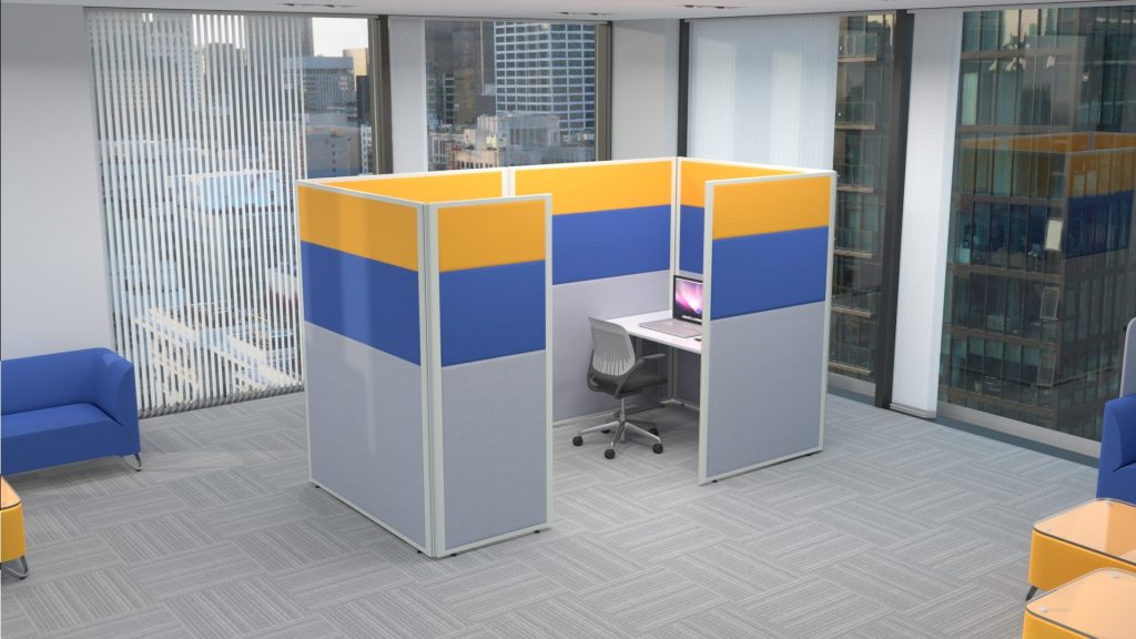
3 part acoustic office screens
3 Part Acoustic office Screen
Doctors waiting room

When have you ever been to the doctors because you feel great? The answer is never!

Naturally every visit to the doctors is because you are unwell or poorly in some way. A waiting room is swarming with germs and bacteria, not to mention the chairs, surfaces and toilets.

Public Transport

A bus, train or tram, all of them are tight confined spaces. Now fill that space with passengers and some with the cold or flu.

There’s no escaping – either for you or the germs.

Holding on the hand rails too? Many hands will have done the same and you may be picking up an unwanted bug.

How to prevent a cold?

It’s difficult to keep completely cold free as we are exposed to germs as part of our everyday life and sometimes we just can’t control or stop it. But we need to keep on top of our health and ensure we do what we can to fight back against the bugs.

It’s unrealistic to refrain from holding a door handle, turning a public toilet tap on or using the office mircowave but we can all make an effort to follow some top tips to prevent catching a cold.

Cold Busting Tips
  • Washing your hands
  • Hand Sanitiser (for when washing your hands isn’t a possibility)
  • Keeping Active
  • Get a good night’s sleep
  • Keep your hands away from your eyes and nose
  • Take Vitamins
Categories
2018 Blogs

Five ways you can use psychology to nail your graphic design

People buy when they have a need for something and consumers buy from people they trust. Knowing what your audience want before they do is how you hook them, and having a great graphic design is one way you can connect with them. Create a graphic design that appeals to predictable human behaviour and you will have nailed it. But how do you do that?

Keep it simple.

Ensure your design is simple and familiar. We humans are visual beings, we make split second decisions based on what something looks like and if it doesn’t appeal, we walk away. Take advantage of evolution and make your design relatable, easy to understand.

You won’t be there to explain to each individual customer what it is you’re trying to sell, so allow your product to sell itself. A great graphic design can also instantly change the perception of a product from complex to user friendly.

Make your graphic design attention grabbing.

The average attention span online is five seconds. That’s it. You have five seconds to pique someone’s interest and persuade them to hang around, if not they’re off. A prime example of this are modern websites.

Look at how websites have changed over the years. You can still find older websites with wonderful examples of how not to do it – pages crammed full of information, a wall of text, inaccessible to all but the most ardent reader. People don’t have time for a barrage of words, simplicity is key.

A design has to be simple to navigate, scannable, easy on the eye and the brain, designed to draw you in and capture your attention at just the right place. Art has fast become science.

First impressions count.

Like anything in life you don’t get a second chance to make a great first impression, and no matter what we are told, we all (subconsciously or not) judge a book by its cover.

Don’t try and be avant garde with your graphic design. A pleasing visual, something clean and simple will appeal to more people, a complex one can put them off.

A picture paints a thousand words.

Communication is key to understanding and you don’t always have to use words to get your point across. If you can find a way to express what it is you are trying to convey without uttering a single word, you have nailed your design. Take for example colour, colour is a powerful trigger for evoking an emotional response: the colour red has been deeply ingrained in our psyche to mean danger, green implies an organic quality and babybird blue is the colour of trust.

Appeal to people’s emotions.

Make sure your graphic design has a visceral effect on those viewing it. Have it tug at their gut, create an instant connection, make them love it but not know why. This can be as simple as a beautiful photograph or a striking use of imagery or simply a combination of colours that are visually appealing to the audience.

Categories
2018 Blogs

Top 5 UK Exhibitions for Start-ups

The cost of exhibiting for any business, not just a start-up, can be astronomical, so you will want to box clever and only participate in those exhibitions that truly work for you and your business.

Exhibiting as a start-up is most definitely worth it when you realise you are quite literally shooting fish in a barrel, they are a marketing dream come true. Presenting your start-up at an exhibition gets your business in front of a captive audience who are there solely to find businesses just like yours.

Where do you uncover the best exhibitions for your start-up? Look no further, as we have listed the top 5 UK exhibitions for start-ups below.

  1. Food start-ups

 Speciality and Fine Food Show

This is the UK’s leading industry showcase of fine food and drink. This exhibition puts your food business directly in front of a high quality audience of top buyers looking to source the very best in food and drink. Not only do you get to present your business, but you will be in great company, standing shoulder to shoulder with people in a similar situation to you. You can discover the latest trends, see whose products have been awarded Great Taste stars and even enter the Seed Fund start-up pitch competition.

  1. Technology start-ups

Wearable technology show

With visionary speakers to inspire you, the world’s media to cover you, buyers to charm and consumers to sell to, this is the one stop shop for your tech start-up. This exhibition is the largest business and prosumer show in the UK. Network, create partnerships, build your supply chain, discover the latest tech gadgets and wearables, whatever you do, don’t miss it.

  1. Wellness start-ups

For those in the health and fitness arena there is a wealth of wellness exhibitions all around the UK for you to showcase your wellness start-up at. The SFN expo in Glasgow’s SEC is the inspirational health and fitness weekend of the year. This high energy exhibition is ideal for you to meet inspirational people in the wellness world, attend live events, meet your fellow brands, but ultimately put your start-up in front of thousands of consumers and trade buyers alike.

  1. Business start-ups

The Business Start Up Show

The go-to show for anyone starting or growing their business. Listen to the UK’s leading business experts divulge their secrets, expose your business to an audience of over 25,000 other businesses and take the opportunity to sell your business and services to these highly targeted consumers. You can also take part in 170 interactive training sessions or pitch to panels of multi-millionaire investors.

  1. Home Interior Start-ups

The Ideal Home Show

Whether your business is soft furnishing production or a complete interior design service, positioning your start-up business in front of a captive audience is key to growing sales. The Ideal Home Show is the UK’s most iconic and trusted home exhibition, celebrating its 110th year this year. Generate sales, launch new products, promote your brand or network with industry key players. This is not one to miss.

Categories
2018 Blogs

Why is colour so important to your office?

Everything we do as humans is viewed through the lens of psychology, and it’s not subtle either. You won’t have to go far to find examples of this in action: Reality TV behemoth Big Brother frequently invites behavioural psychologists to analyse the actions and interactions of the people living under the microscope, as it were.

While this use of psychology serves a very entertainment-driven focus, businesses and brands have been using psychological factors to direct a lot of their decisions for a long time. You don’t have to have a degree in social sciences to use some of these tactics to motivate your staff, we’ve many years experience in both design and production of office screening and we want to share 3 killer concepts that will definitely boost productivity.

Consider your colours

There’s more than a few idioms we use that involve colour. Seeing red, feeling blue, green with envy. Colour is commonly associated with specific feelings, and there’s been many studies that back up the notion that certain colours can evoke a certain response. Of course context matters, and we all perceive colour differently, but research seems to universally agree that red can represent power and strength, green depicts balance and calm, while yellow is commonly associated with optimism.

Use it: Want to spread a positive message? Make yellow a dominant colour in your office screens!

Shaping up

Everything is made up of a series of shapes, but when we hear the word it’s really common to just picture one or two based on geometry. Some of the most recognisable brands can have their logos analysed against the backdrop of shape psychology, and plenty of scientific research has validated this approach to design. For example, circles can be associated with wholeness and continuity, while triangles are often said to represent dynamism. Squares are the most commonly seen shapes and are commonly associated with feelings of strength and reliability.

Use it: Screening doesn’t have to be boring. If you want a more contemporary feel look at screens with more shape such as curved, wave or even a mixture of styles!

The Gestalt Principles

While this collection of theories goes back many years, it can still be defined as a relevant part of modernity. Gestalt principles examine how the human brain makes connections between visual elements. This can be either based on proximity, similarity, closure, continuation or figure/ground (the idea that in a visual there are some elements that the brain immediately sorts as ‘background’ and others that are pushed forward as the ‘figure’. These principles are used a lot in logo design and examples of it are plentiful.

Use it: Understanding that the brain could wrongfully group visual content together can be a useful tool in when designing your office layout.

Sources
http://www.colour-affects.co.uk/psychological-properties-of-colours

https://tubikstudio.com/knock-design-into-shape-psychology-of-shapes/

http://www.flintriver.co.uk/the-psychology-of-shapes-and-symbols-in-graphic-design/

http://coglode.com/gem/von-restorff-effect

http://3.7designs.co/blog/2012/08/10-psychological-principles-to-design-with/

https://www.bcrpainting.com.au/bcrpainterblogs/2017/9/1/why-should-you-pay-attention-to-colour-psychology 


Notice: ob_end_flush(): Failed to send buffer of zlib output compression (0) in /home/godispla/public_html/rapind.com/blog/wp-includes/functions.php on line 5427