Categories
2016 Blogs

Behind the Design: Practical Solutions for Modern Offices

Harnessing Office Design to Boost Productivity in the New Year

The office. The environment that millions of Britons (and many more worldwide) get to endure and enjoy for at least eight hours a day, five days of the week. The office, witness to drama, despair and elation and the setting which a few of us love but the clear majority of us outright hate. The office design which featured in the satirical television series of the same name is a stereotypical yet in most cases, genuine representation of how our own four-walled offices appear. Whitewashed walls, cubicle-styled desks and tapping, endless and monotonous tapping on keyboards. Work can become stressful and frustrating, but this ebbs and flows. But the office seemingly never changes, the same frustrations emerge and grow every day, slowly chipping away at the productivity, creativity and probably sanity of everyone who works within one.

Fortunately, modern start-ups and design companies in particular are taking the lead in creating offices which are tailored to actually help and encourage people to work. These designs take inspiration from when we design our own homes; everything from the colour of the walls right down to the fine details are selected by us and carefully tuned to make the space as comfortable as possible. Traditionally, the idea was that we should be setting up our desks with little treats from home to help ‘re-create’ that feeling, but ultimately it just made us hate the office more as we realise what we are missing out on. But modern office design is evolving that theory. Modern offices are increasingly adapting to the needs of their employees, setting up spaces and surroundings which create comfort and eliminate distractions which help people to focus.

The Cubicle is Dead, Long Live the Cubicle

Simply searching for office design will reveal some pretty crazy designs, but there is logic behind the madness. Admittedly, many smaller businesses cannot accommodate the lucrative costs of some of the professional designers used, but the practical elements behind some of the design decisions can be employed in any environment. One of the most striking features of modern office design is that the cubicle design is gone (sort of). Desks are no longer tightly knit together is small clusters on this basis of collaboration. Instead, we are now being taught to make the most of the space which we have available. With the advent of computers, there is no need for filling rooms and hulking filing cabinets anymore, so additional space is opening to allow people to spread out and create the areas they need.

The actual size of your office will play a part in this and while adapting is often the case, a small and compact office size could become a permanent hindrance on productivity. Reason being that small areas amplify small niggles. Noisy colleagues can be easily blocked out if you are sat 15 yards away. However, if they are a foot away, their pet peeves can be inescapable, further escalating stress levels and reducing your effectiveness. Furthermore, small offices suffer from acoustic issues, especially when multiple people are cramped inside. The rattle of keyboards in use, telephone calls escalating in volume as everyone tries to talk over each other and general chit chat are all emphasised, leading to distractions and the loss of valuable minutes and hours in the day.

Clever Use of Colour and the Hidden Benefits

The layout of the office makes the most significant visual impact on anyone who walks into the space. However, when you are sat in such an environment for multiple hours every day, you start to pick up on all of the fine details at hand. In traditional designs, you begin to pick up on how dull and dreary the colour scheme is as well quickly discovering how rigid and depressing the whole environment can be. The aim of the modern office design should be to change this perception. Colours when used in moderation can boost an office both visually but also psychologically for the employees. Bright colours promote happiness and calmness, while intense shades such as reds are designed to motivate and get people fired up about what they are doing.

One of the tactics employed at Google is the idea that the office should constantly change. Every week, seating areas would be re-arranged, promoting the concept that the nature of the work they do is constantly changing and therefore their staff should be constantly prepared for this. Now, admittedly this is probably unattainable with a static office space, but the idea that things need to be constantly changing is something that we can all learn from. The best way of doing this, is through nature. Flowers, plants and more tap into the pastoral part of our mind, they develop and grow alongside the employees which mirrors the development which you will be hoping for within your business.

Office Design Should Be Tailored to Your Company as Well As The People Within It

Finding a practical solution for your office can actually be very simple. On a one-to-one basis, find out from your employees what makes them tick, how they like to work and what really gets on their nerves about the office design. If your design team is struggling to concentrate with noisy neighbours, then it is time to consider giving them the privacy as well as the resources to be as creative as possible. Drab, noisy and distracting environments stifle productivity, decrease the wellbeing of your employees and ultimately harm your business.

Gauge what colours they would like to see, the kind of layout they wish to work in and the finer details which they believe can improve their working environment. An office design should be dynamic and in turn, provide space for your business to grow, but it is important to remember that over stuffing the space can and will cause considerable issues in the future.

Rap Industries have been designing and manufacturing office furniture for over 40 years. We take great pride in applying the feedback of our clients in all of our new furniture designs. With office screens, room dividers and acoustic pods available, we have a wide range on offer to enhance your office. For more information, please call 01733 394941 or send an e-mail to sales@rapind.com.
Office Design

Categories
2016 Blogs

Anti-Bacterial Office Design: A Clean Approach

Integrating Anti-Bacterial into Your Office Design Has Benefits for Your Business and Employees

Aside from the elections and referendums dominating the news this year, there has been another story rumbling under the surface which we should be taking notice of. In recent years, emerging reports have begun to cover the issue of resistant bacteria which is not affected by the anti-bacterial hand wash that everyone started to get obsessed with a few years back. Now the issue is becoming more prevalent and more resistant bacteria means a faster spread of illness and the inevitable increase in sick days

This especially applies to classrooms and offices which have a reputation as hotbeds for spreading illness and disease. While cleanliness obviously plays a factor in this, it also includes the amount of time that large groups of people spend together in this environment. On the other hand, hospitals can mitigate this by adding anti-bacterial surfaces throughout while providing anti-bacterial gels and soaps throughout the site. However, the same cannot be said for other public places. If we are going to be more vulnerable to illness, then both businesses and educational facilities should be more aware about healthiness in the design process to keep the number of sick days down and thus, boost productivity and the wellbeing of those who occupy these environments.

Offices Have a Chequered History with Employee Health

Any environment which is inhabited with a large group of people over an extended period is going to be vulnerable to the spread of illness and infection. As our office designs strive to encourage communication and teamwork, the open and collaborative nature of the modern office can subsequently become a major factor in the quick and efficient spread of nasty bacteria. The problem, as is always the case with bacteria, is that we cannot see the effect without the use of a microscope, so cleanliness and general wellbeing often fall down the list when new office designs are being drawn up.

The most recent government statistics (http://www.ons.gov.uk/employmentandlabourmarket/peopleinwork/labourproductivity/articles/sicknessabsenceinthelabourmarket/2014-02-25) from 2014 revealed that people in the UK, took 131 million days off sick with common illnesses often cited as being the reason for the absence. As we have explored in the past, one major contributor to this is the growth of environmental stressors such as audible and visual distractions which lead to heightened stress levels and weakened immune systems. In total, the study estimates that sick days reported by businesses across the UK resulted in a deficit of approximately £16bn per year.

Attacking the Issue at the Source

The minute nature of bacteria means that the issue needs to be addressed at the source. Here at Rap Industries, one of the ways we are tackling this is to begin introducing silver ions into our office products which helps to quell the spread of bacteria. When we think of silver, we can be quick to conclude that silver is a bit of a luxury material, often used to make currency. However, silver has a unique quality that simply cannot be found in any other material on earth. On a particle level, silver ions can interrupt and completely prevent bacteria from growing and spreading. In fact, silver nanoparticles can now be found in cosmetics, socks, food containers, detergents and many more to combat the spread of illness and infection. Technology firms are even introducing it into the touchscreen of your phone, so are modern interior designers taking bacteria into consideration when designing the spaces which we spend the majority of our lives in?

Implementing a Healthy Office Boosts Productivity

Introducing anti-bacterial throughout your office does not have to constitute a complete overhaul of the design. With plenty of healthy bacteria out there which helps our bodies to thrive, it would be overzealous to begin coating every wall, phone and pencil with silver ions simply because we are trying to prevent the common cold. However, one solution which has been developed at Rap Industries, a leading manufacturer of partition screens for over 40 years, is to integrate the anti-bacterial technology into office screens. These incorporate the flexible design of partition screens, which are traditionally used to combat those audible and visual distractions which we touched upon above.

An anti-bacterial fabric is then applied and silver ions are integrated with the framework to help prevent bacteria from spreading. What makes this solution ideal is that the screens can be used to apply a partial divide in the open plan environment, allowing collaboration to continue while providing privacy to those who thrive in it. Then, by making the partitions anti-bacterial, this helps to protect colleagues and co-workers when a bout of the sniffles begins to break out in the office.

On their own, anti-bacterial screens are not being utilised to their full potential and achieving this requires consideration towards other elements of the design. In the study cited earlier, alongside illness, a major contributor to the sick day is back and neck strains which are commonly caused by poor posture and a lack of information regarding staying healthy while working at a desk. Anti-bacterial may be great at stopping you from catching the flu, but it is going to have no impact on whether you strain your back by slouching all day.

The Clean Approach to Managing Office Design

Workplace safety is something which we commonly associate with primary jobs such as agriculture and construction. Only in recent times have we started to realise the impact that office environments can have on our health and fortunately an increasing number are exploring the impact of issues which we simply cannot see. For example, acoustics and bacteria can both have a significant effect both short term and long term and as such, it is important to factor these in when creating a fresh design. Healthy workplace designs significantly boost the productivity of employees and help to make the business more efficient on the whole.

Rap Industries have been developing and manufacturing office furniture and partition screens for over 40 years and our designs are moulded by the feedback of our clients. One of the results of this is the Safeguard Screen which integrates anti-bacterial fabric into a partition screen, helping open plan environments to address issues concerning privacy as well as health.

Anti-Bacterial

Categories
2016 Blogs

Re-Vamping the Office Design: 4 Ways to Rejuvenate

Breathing New Life into Office Design for the New Year

With the new year approaching, it’s around this time that we begin to consider changes we hope to make whilst blocking out the incessant ring of Christmas songs. As we all start looking towards the fresh start which the new year brings, the dull and drab surroundings of the office often begin to rear its head. Okay, it hardly falls within the usual category of a new year’s resolution, however rejuvenating the office design can have significant and long-lasting effects for your business. A few splashes of colour or replacing the squeaky chairs alone can go a long way to boosting productivity and re-invigorating your employees in the new year.

Office design is often more complex than it first appears and many modern layouts are often sculpted by professional designers, however with careful planning and consideration, it is still possible to achieve a similar result on a much more agreeable budget. The layout of your office does not have to be fancy and elaborate, instead, removing some pet peeves and making the overall environment more practical can help to breathe new life into the business.

Integrating Practicality into a New Design

Upon entering a room, the first thing which we are struck by is the visual appearance of what we are looking at such as colours, lighting, furniture and so on. However, the foundations of any great design are built upon the practical side of things; natural light, sound and visibility. Without professional help, these aspects are often the ones which get overlooked and therefore ultimately hinders your new design throughout the year. It is important to remember the people who will be working within the environment and tailoring the space to adapt to them. While opening the space up to freedom and collaboration may appear like a wonderful idea, this may not be the case for many of your employees.

While the aim of a rejuvenating office re-design will revolve around how it appears, factors such as the acoustics of the space and how much privacy employees are afforded will have a more substantial impact on employee productivity. Frequent distractions, whether caused by persistent noise or visual interruptions can mount significantly over time, leading to frustration, stress and even potential health issues in the future if left unaddressed. A comfortable design on the other hand creates favourable working conditions, which enables staff to focus and complete tasks in an effective manner.

Finding the Right Blend of Colours

Crafting a new office design provides a great deal of creative freedom to style the surroundings to your own tastes, but it also means they can be tailored to your business. Colours have a subtle yet important impact on mood and the right blend can help to encourage creativity, calmness and even passion when integrated correctly. Traditional offices favoured whites and cream shades which appeared clean and pristine, yet created an atmosphere which resembled more of a prison cell than a working environment. Instead, take the opportunity to look around at other modern offices for inspiration and to see how they make the most of colour to create welcoming and comfortable spaces for staff.

So, if your industry is tasked with creating and designing, then shades of yellow and orange are ideal for encouraging creativity as they trick the mind into the feeling of cosy summer days. Alternatively, if you are looking to push a certain department, for example a sales department, shades of red are excellent for evoking passion as crimson shades inspire emotions which we may commonly associate with anger. Finally, if you aim to simply calm everyone down and keep stress levels under control, then shades of blue evoke the calmness and serenity of water and blue skies.

Peace and Quiet Matters More Than You Think

The most successful office designs are those which can integrate the ideas and opinions of those who will be working within them; the employees. Over the past few decades, all theory has pointed towards the development of ‘collaborative’ work environments which naturally encourage individuals to work together. Therefore, many conventional examples which you can see have these hubs of desks, holding separate departments together in close proximity and quite literally forcing them to work together.

Excellent in theory, a potential disaster in practice. It is true that some people will thrive in such conditions, provided with the social stimulation which leads to a melting pot of ideas while still being able to concentrate despite all the activity revolving around them. Yet for many others, the situation is the exact opposite. Distractions, especially audible and visual, constantly interrupt the workflow, severely hampering productivity and ultimately increasing agitation and frustration.

Consider Beyond What You Can See

As an alternative to conventional designs, an option worth considering are anti-bacterial furniture such as Safeguard screens. Adopting the conventional design of partition screens or portable screens, these serve a dual purpose within modern office designs. First and foremost, they are excellent for providing privacy and an area away from the hustle and bustle of the rest of the office, ideal for those who require space to concentrate. As an added benefit, they also provide protection against the spread of nasty bacteria. Especially in larger environments, it can become incredibly simple to spread illness and infection, which ultimately results in expensive sick days and time taken off work.

With any luck, these tips should provide more context on some of the finer details of office design. If you have an idea in mind and are considering creating practical office environments, then as manufacturers of partition screens and more, there is a bit more which we can do to help. Either check out the Rap Industries website to explore some of the furniture we produce, or give us a call on 01733 394941 for more bespoke advice.

Office Design

Categories
2016 Blogs

How to Solve the Biggest Problems with Office Design

Identifying the Issue

The office is somewhere that we spend at least eight hours a day, five days a week for over 300 days a year. For most of us, we end up spending more of our lives in an office than relaxing at home. What a wonderful thought. This fact is made altogether worse when the office is cramped, too hot, noisy and whatever else grinds your gears. When the first offices started to spring up, they looked to adapt the model of industrial revolution factories. Rows upon rows of workers, furiously working for hours while being overseen by the head of the company. Some modern-day companies may even still run this way, but for the majority, times have changed and office designers are showing a bit more concern for the people who must sit in them all day.

When you spend time in the same environment repeatedly, you will begin to notice the tiniest of details. Cracks in the walls, mysterious smells and creaks in the floorboards, your brain naturally begins to process everything around you. When you work in an office, the same process happens. When the job starts out, everything is fine as you try to absorb the new surroundings. But after a few days, weeks or months, you will unwittingly begin to identify all the sights, smells and noises all around you. The colleagues who you try so hard to get along with can quickly become associated with their mannerisms and these will grow ever worse day by day, unless they are resolved.

Addressing the Prominent Issues with Office Design

With no signs that the open office layout will be fading away any time soon, modern offices are increasingly looking to adapt to some of the major issues which arise from these ‘collaborative workspaces’. The whole idea behind them in the first place is that by placing employees next to each other in a block design will help them to collaborate more as they never have to leave their desk. It serves that purpose fine, but what happens when deadlines begin to loom and pressure starts to mount? How collaborative do you think people are when stress levels begin to reach an unbearable amount? If you have worked in an open office, then you will already know the answer to this.

While open style, collaborative spaces have their benefits, it is still necessary to create areas which allow people to have privacy and the conditions to concentrate. Fortunately, it is not necessary to create permanent, separate spaces. Instead, modern furniture and technology can help to transform existing spaces, making them more effective and ultimately more productive. These also need to take into consideration that individuals will often have different work styles. While some may thrive in busy spaces, others can begin to feel overwhelmed and it is important to have those quiet areas where they can retreat to.

Distractions, Distractions, Distractions

There are three main factors which drag the concept of the open plan office down; noise, privacy and comfort. One of the main reasons why the trend of working from home is on the rise is the fact that it directly addresses these three issues. Unfortunately, the nature of the work that many office workers do means that this arrangement is not always possible, which is why interior designers are increasingly working towards replicating the same conditions of a home into the office. In essence, this means cutting down on both audible and visual distractions.

One of the major flaws with a lot of solutions that you find online is that they call for modern office design to create separate areas which are adapted to either a collaborative space or a private space. This is fine for organisations with large offices, but as a result, this hardly leaves many options for small businesses. Fortunately, with products like desk dividers and partition screens available, it is possible to recreate the conditions without making a large investment.

Noise is perhaps going to be the trickier of the two distractions to combat, especially in small spaces. Considering that sound by nature is very unpredictable, creating an environment which combats it can take some testing to perfect. The solution to combating this is to introduce soft surfaces and if your budget can extend so far, ensure they incorporate acoustic foam. This innovative material is increasingly being used in desk dividers, wall panels, padded flooring… you get the picture. On a basic level, sound reverberates by bouncing off hard surfaces, so if you fill the area with soft surfaces equipped with acoustic foam, this will actively combat reverberation time, effectively reducing ambient background noise.

The Benefits of Perfecting Office Design

The perks of creating an effective workspace can often be hidden, however it will begin to reflect on your business long term. While it is perhaps unreasonable to expect all your employees to be giving 110% as soon as the new design installed, the biggest difference will start to appear once crunch time begins to hit. With a work space, which promotes collaboration while still providing privacy, this provides employees with more freedom to concentrate and get on with their work. If working with colleagues is required, then the proximity means that this is easy to achieve. Yet if they require peace and quiet to focus, they can retreat behind the desk dividers and block the most prominent distractions.

For over 40 years, Rap Industries have been designing and manufacturing office furniture which is tailored to meet the changing needs of clients. With partition screens, desk dividers and much more available, each is extensively tested to ensure they can improve any office environment. For more information on the services provided, please visit the site, give us a call on 01733 394941 or send an e-mail to sales@rapind.com.
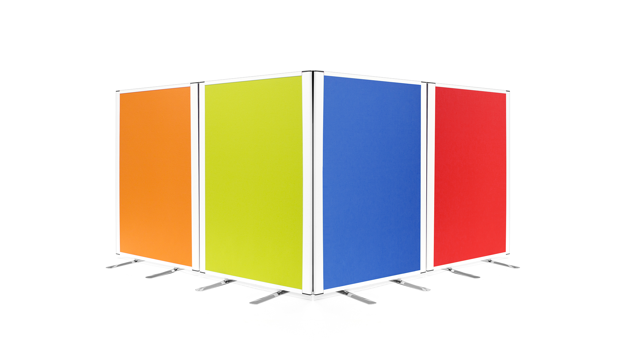
 Office Design

Categories
2016 Blogs

The Ultimate Cheat Sheet to Find the Perfect Office Partitions

How to Get the Most Out of Office Partitions

Okay, we’ll admit, office partitions are not going to be the most exciting part of re-designing your office or open plan space. That said, they do serve a crucial practical aspect of office design which you cannot afford to ignore in the long run. Why? Because lacking due care and attention for the practicalities of the design can lead to major issues in the future concerning stress, health and wellbeing. Quite important considering these have occasionally been enamoured as a ‘glorified sheet of wood’. Most offices, classrooms and meeting rooms appear to the naked eye as a naturally forming collection of chairs and desks, so it might come as a surprise that some interior designers get paid thousands to design these things.

So why? Assuming you have ever worked in an office, then you are probably already quite aware of some of the perennial issues. Chatty neighbours who have yet to find the mute volume; colleagues attempting to block everyone else out in the room with headphones, yet inadvertently annoying everyone else with that tin-like crackle escaping from the pods and your boss who spends the majority of the day, furiously rattling out e-mails by punching the keys into their keyboard. Each environment is unique and everyone has their own pet peeves, but once we latch onto one of these, they are nigh-on impossible to escape.

What Is the Point?

If you were around in the 70s, 80s or even 90s then you might have had the pleasure of working in what is now affectionately known as the cubicle. This represented the first and what we now know as a misguided attempt to address noise and distractions which grew horribly out of control in plain open plan environments. Rather than going back to that open design, reform is required in order to find a balance between the idyllic, collaborative workspace and a private area which provides the conditions which humans need to concentrate and thrive.

Office partitions feature many tailored designs which are aimed towards addressing this exact issue. Their main purpose is to create privacy in areas where it is not normally found. While the screen itself is effective in addressing visual distractions which are commonplace in environments such as these, it is the options available with them which enables them to be incredibly effective in a variety of different spaces. Productivity is one of the main beneficiaries of successfully installed office partitions, however they can also be effective at boosting wellbeing and even happiness.

The Fine Details:

Thinking of stereotypical partition screens and often one of the first things which comes to mind is that murky looking fabric, available in miserable greens and depressing shades of red. Fortunately, some scientists also did some research into how our surroundings affect our brain, so now they can be customised in a number of ways which is going to ‘stimulate our minds and get the creative juices flowing’. The possibilities do not stop there either, instead, many suppliers can finish the screens with a variety of different materials, which allows them to adapt to different environments. Safeguard medical screens for example incorporate an anti-bacterial fabric, which actively combats the spread of illness and disease. Modern day office partitions offer substantially more to your business now; epitomising the term, multi-purpose.

One of the options which is incredibly useful, but you would never notice is the introduction of acoustic foam. If you have ever set foot into some fancy offices, then chances are, there is acoustic foam integrated all around you. Into wall panels, ceilings, screens and more, acoustic foam which is traditionally used in recording studios is increasingly being used in offices to help create more productive work environments. So why bother? We’ve already identified that audible distractions are one of the biggest nuances in the modern day office and acoustic foam is designed to directly address that. It is never going to be able to block out the sound of your noisy colleagues completely, but it is incredibly effective at soaking up soundwaves, which reduces the reverberation time and altogether ‘dampening’ the noise in busy offices.

How Can I Make the Most of Them?

Start by looking around at the options available as many manufacturers will create them in different styles with a myriad of options. Office partitions should be viewed as a long term investment, so be on the lookout for good quality screens which you know will actively be able to improve your office. If you wish to reduce the ambient background noise in your environment, then be sure to find acoustic screens which are legitimately tested, tried and proven to work. Then once they arrive, experiment with how they integrate in your environment. Soundwaves are incredibly unpredictable and completely invisible, so while a layout may look great, you may not be getting the best acoustic result.

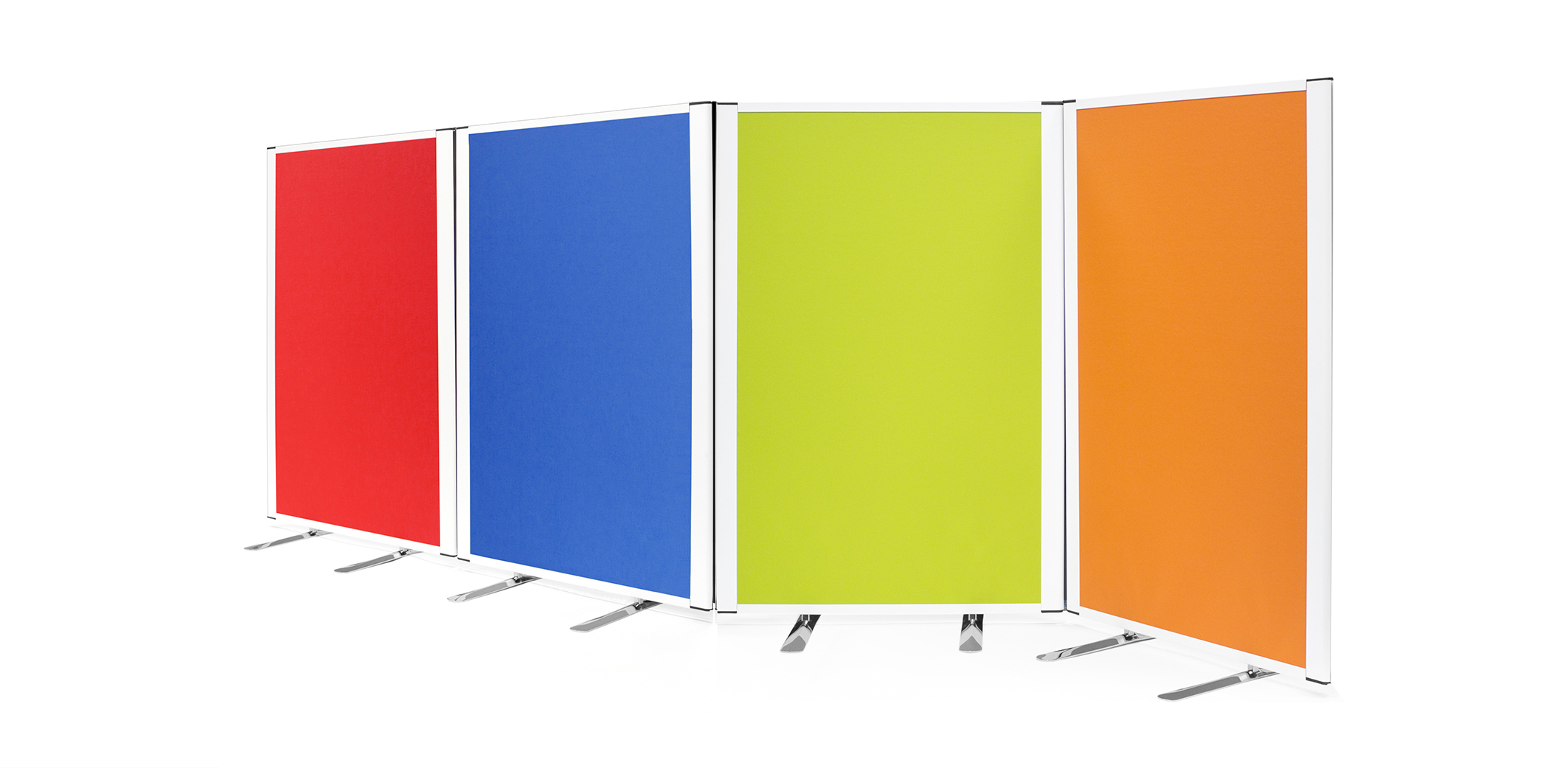
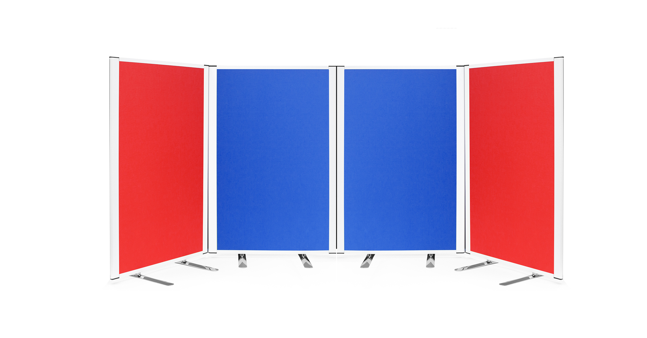
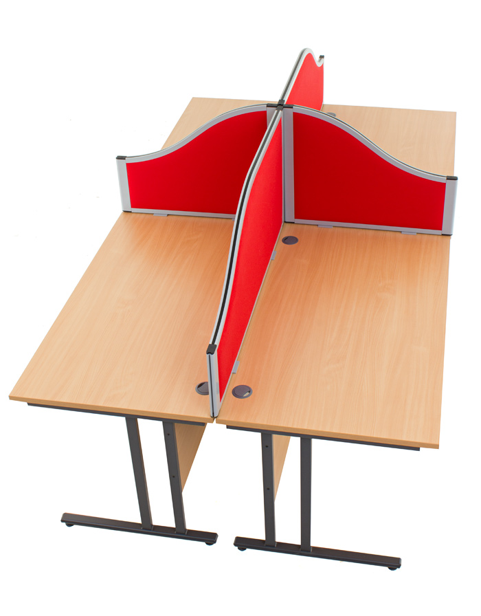
Most of the office partitions which you will find are available in three different styles; free-standing, desk screens and desk dividers. Free-standing screens are ideal for completely separating a space, essentially creating the illusion of two separate rooms while allowing them to be merged back into one of it is ever required. Desk screens on the other hand do the bulk of the work when combatting noisy colleagues. These simply stand in between desks, allowing the design to retain that open office style whilst installing an acoustic-proof panel which in the long term will be able to help your employees to concentrate. Finally, there are desk dividers, these will simply clamp to the desk and offer a more convenient if slightly less-effective solution for creating office partitions.

If you are looking for a place to start when it comes to office partitions, then we manufacture a wide range high quality screens which will give you a good place to begin the search. With fabrics such as anti-bacterial and acoustic screens included, as manufacturers we can tailor office partitions to ensure they actively improve your office environment. For further guidance on the service we provide, you can either give us a call on 01733 394941 or send an e-mail to sales@rapind.com.
Office Partitions

Categories
2016 Blogs

How Room Dividers Can Be Used to Solve Your Privacy Crisis

Why Privacy Matters So Much to Us

Every business relies on its workforce to succeed which means that every business is always striving to find the means to squeeze every last bit of effort out of them. The past century has seen some innovative and creative ideas implemented while others borderline the ridiculous. However, often the factors that many designers and business owners overlook are the simple necessities in life. If your open plan environment is still rife with stress, discomfort and bears no resemblance to a productive workspace even after a re-design, then chances are you need to look between the lines to find a solution.

Rather than blaming workplace inefficiency on employees in a whim, take step back and look at the environment as a whole and if necessary, call in an objective voice to help. While many modern office designs can look stunning and more than enough to feature in your monthly newsletter, the real root of their success runs much deeper. If you were to hire a professional interior designer, chances are they would begin to explain the concept of human needs. While open plan environments can look remarkable, they are often built around the idea of keeping employees warm, well fed, well-watered and ultimately comfortable within their environment.

Prioritising Effective Work Spaces

When you are hearing about these wonderful new offices that Silicon Valley start-ups are creating; the idea that having food within 100 metres of every employee sounds like a ridiculous luxury. But it should not be. The fact is that this is a feature that we enjoy at home and it is that atmosphere which modern day design is attempting to re-create. Rather than moving our living rooms into the office, the aim is to create environments which are comfortable for people to work in. Once they are satisfied and devoid of distractions, this is when they can work efficiently and effectively.

There was once a stigma over working from home, that it provided the opportunity to slack off and rush whatever work had to be done in an hour. The reality has been very different. By working in a comfortable environment, the benefit for employees has been comfortable surroundings which allow them to operate at an effective level throughout the day. Rather than procrastinating in the office, waiting for the ambience of the surroundings to die down, instead they are able to work, distraction free for short and frequent intervals.

Common Invasions of Privacy While Working

Now, the issue is finding the right balance between the comfortable environment of home and integrating it with the often manic style of the modern day office. Other than creating individual, private offices, there is no way of removing distractions completely. Larger companies tend to work around this with completely separate workspaces tailored to different moods, but we understand that this kind of setup is incredibly unrealistic for smaller businesses. Therefore, the solution needs to be a compromise, creating a pseudo-private environment with all of the perks of a collaborative workspace.

This is what room dividers and acoustic screens are tailored towards. The nature of their design is focused towards cutting down on some of the more common distractions that you tend to run into in any office. The drone of conversations and seemingly perennial phone ringing are a couple of the worst culprits. Meanwhile, visual distractions are a regular disturbance, even if you rarely notice. I would wager that at some point whilst reading this post, you will have glanced up for some reason, whether to look out of the window, checked out what your colleague is harking and raving about and so on.

Using Room Dividers to Create Privacy in Any Environment

At which point, you are probably wondering why room dividers have any impact at all considering distractions are often an issue in close-knit environments. Well, firstly their obvious design focuses on diving open plan spaces, creating this idea that the space is separate, without the need for a brick & mortar wall. If you consider why homeowners use room dividers in their home, then chances are there is a more practical element behind the decision, rather than just a stylistic one. In terms of office design, room dividers come in many different shapes and sizes, some allow natural light to flow through, others are completely mobile and many can even be finished with a variety of different materials.

Where room dividers and office screens really come into their own is the introduction of acoustic foam. This is a material which you may commonly associate with fancy recording studios, equipped with that strange triangular material on the walls which supposedly block the noise and prevent it from escaping. Well, that last part is somewhat a myth, but acoustic foam is incredibly effective at absorbing soundwaves; not entirely, but enough to regain control of volume levels in open plan office environments. If you are constantly being harassed by a particularly boisterous colleague across the room, then acoustic room dividers can be extremely effective at soaking a lot of it up, before it becomes a constant niggle.

Resolving the Privacy Crisis

Creating environments which are comfortable for employees can take time and a little bit of investment. While large organisations may be able to afford to bring in an acoustic engineer, small businesses would be better off experimenting with soft furniture and soft surfaces which are naturally effective at absorbing ambient noise. The issues with each office will be unique, so there will need to be extensive self-examination to determine which solution will work best in your environment. On a basic level though, room dividers and office screens can go a long way to creating a degree of privacy for employees as they are able to address both audible and visual distractions.

If room dividers and office screens sound as though they could be effective in your office, then we do design and manufacture a variety of styles here at Rap Industries. We’ve been in the industry for over 40 years, which has allowed us to develop extensive expertise in the sector while working with clients to address the issues in their workplace.

Room Dividers

Categories
2016 Blogs

Why Acoustic Screens are the Future of Modern Office Design

Creating Workspaces Which Optimise and Energise Employees

Office design has been the subject of a great deal of study over the past few decades and for good reason. Considering millions of us spend up to and beyond eight hours a day sat behind a desk, it makes sense that we try to understand that environment as much as possible. Our careers and the job we do is often about much more than the work involved and employers as well as designers are constantly trying to find ways to make employees more productive and more effective. Some may take a traditional approach of bonuses and prizes, while others take a more practical approach and attempt to find the means to help employees enjoy their job.

While the design of the office may seem unsuspecting, it can actually have a major influence on employee satisfaction and productivity. The reality is, if we hate the place where we work for just one of a number of reasons, then this crushes motivation and begins to decrease efficiency. Ultimately, it can be a revolving cycle unless the route cause is addressed. Distractions are one of the major causes of disruption, especially within open plan offices and these can often spawn further complications with stress and anxiety further along the road.

The Key for Managing Distractions

In recent years, there has been a huge upswing in the number of people working from home and according to them, this has made them more efficient. The main reason for this is that there is more privacy in the home. You are not constantly interrupted by the constant hum of background chatter or regularly interrupted by a telephone crying out to be picked up. Instead, they are able to take work at their pace, without the constant distractions and this has actually led to improvement. The result has seen modern office designs try to adopt what makes this approach to working so successful; comfort.

Cutting out distractions altogether in open plan environments is pretty much impossible thanks to physics, which is why many of the modern offices that you read about today take a slightly different approach. Often this is to create separate areas; one for communal work, where employees can communicate and liaise while working on a project and then another which encourages silence, privacy and the space for employees to concentrate when they really need it. Sounds simple enough, but for the majority of small businesses, being able to integrate this is not feasible. There is no room for a huge office, instead employees are housed in enclosed spaces which can become a cacophony of noise.

What Makes Acoustic Screens So Effective?

This is where Acoustic Screens are becoming such an effective solution. The cubicle office design of the 1960s may have been an unmitigated mess, but it did strike upon a few key points which have a positive impact for employers. Modern day acoustic screens often come in three different forms; as standalone screens, desk dividers and as wall panels. On a base level, these help to create partial partitions in office environments, which when used correctly, can drastically reduce the number of visual distractions and creating an element of privacy for employees. In particular, this can reduce a common worry of people looking over your shoulder at what you are doing as well as becoming distracted by what others are doing across the office.

But what really sets them apart compared to other elements which are part of modern office design is their introduction of acoustic foam. Tackling acoustical design is often one of the hidden demons in any open environment. It is pretty easy to make it look glamorous when you use your eyes, but protecting against sound waves presents a completely different challenge. They cannot be seen by the naked eye, they are unpredictable and they can niggle away at you every day before they simply become too much.

At the core of solving this is introducing soft surfaces which absorb some of these sound waves, rather than letting them bound from surface to surface until they run out of energy. So if you were considering a stylish hardwood floor for your new office, perhaps reconsider unless you enjoy listening to recurring echoes for eight hours and more a day. Instead, acoustic screens ensure you don’t have to cover the walls with carpet as the acoustic foam integrated within the screen is clinically proven to help absorb soundwaves and reduce reverberation time. While it is impossible to block out ambient noise altogether, an acoustically controlled environment can make life easier for everyone when they don’t have to hear every word of every conversation throughout the day.

Integrating Acoustic Screens into a Modern Design

So acoustic screens can be remarkably effective in busy open plan environments, the next step is to fit them in with the design you have in mind in the first place. Options such as acoustic wall panels are clever ways of introducing the acoustic foam without having screens scattered through the space. While they may struggle to absorb noise coming straight towards you, they will help to absorb ambient background noise which is bouncing across the office. Alternatively, acoustic screens excel the most when used in between desks. Creating a collaborative workspace requires tender balance, and quality screens help to achieve this. They soak up soundwaves heading towards you from across the office, while they also provide relief from visual distractions when you are trying to concentrate.

If you approach a specialist manufacturer, there are a huge number of variations available which can be tailored with your office space in mind. This includes straight or curved panels; fabric or glazed panels and a wide range of customisations such as colour and size, meaning they are able to enhance the office environment. Especially in smaller spaces, acoustic screens are an increasingly effective way to create privacy and comfort for employees, providing them with a solid foundation from which to work and concentrate.

As a manufacturer of acoustic screens and room dividers, here at Rap Industries we have a number of ranges which are tailored towards making your office environment more practical. You can check them out online, or alternatively you can get in touch with our advisors who can provide additional information. They can be reached by calling 01733 394941 or by sending an e-mail to sales@rapdind.com.

Categories
2016 Blogs

How to Create an Eye-Catching Display

Display Boards Are Versatile, So They Can Be Used Anywhere

When it comes to creating displays, some of us are more creative than others, let’s be honest. If you have ever been to a craft fayre or an exhibition, there are often beautiful displays that leave us wondering; “how could I make one like that?”. Fortunately, it does not have to be that tricky and in fact, with some time and attention, we can all create majestic exhibition displays which we can be proud of. There is nothing fancy involved, just some simple guidance on how to clean up the content and bring your most important pieces to the centre of attention.

Rather than fiddling around on the day, do all of the design work before-hand, experiment with the positioning of your content and the most important thing to remember are different perspectives. When your display is set up, chances are visitors will not be stood right in front of it like you are, so consider where they will be approaching from and whether your design caters for that. The designs that really do well and stick in the memory are those which really stand out and this is where a great design is crucial.

High Quality Graphics

Regardless of what your content is or where you are exhibiting, chances are you will be using some form of graphics. Whether it is artwork, text or an image, there is one simple rule to keep in mind. Ensure it is a high resolution image! Any professional designer will tell you that their pet peeve is graphics which have essentially been pulled off of the internet and look terrible as soon as they are printed. This is especially important if you are printing your own work and use a low resolution as you will never be able to do it justice.

Nothing in your design is going to come across as cheap and as haphazardly made as images and text which are pixelated. These need to be clean, crisp and even printed properly to help them to stand out. Look for high quality paper and use a proper printer (no, not an inkjet!). If you do not have this kind of image to hand, then I would suggest either finding one, or getting some professionally made. At the end of the day, this will be the core of the display so it needs to set an example.

Positioning of Content is Crucial

There is a lot of theory that runs behind great designs and unsurprisingly professional designers are not just pulling it out of thin air. Any design you see, whether it is an advertisement, glossy magazine or a fellow exhibitor’s display, is supported by a few key theories as to how content can stand out more. One of these which you will want to consider is how to direct the viewer’s eye through your design. We never notice it when we are doing it, but there are small details in designs whose main purpose is to tell us where to look.

The simple explanation behind this is to emphasise the elements which you want to feature prominently. If there is a piece of content which you want to highlight, then make it bigger than the rest. If you want to draw their attention to a piece of text, then change the font and adjust the size slightly. To your viewer’s brain, these are cues which are telling them to look there and then take a look over there. You may only have a few seconds to really engage someone’s attention, so put your best piece at the forefront to entice them to engage with the rest of the display.

Comic Sans Looks Awful, Really.

Text will feature in your display at some point, which means you have the unenviable task of picking out a font. There are thousands and thousands out there to choose from, so there is a lot of potential to find something unique. However, going back to what we discussed at the beginning, consider the perspective of your viewer. If you have opted for a radical font for your three paragraphs of content, who is even going to bother trying to read it? While a font may look exciting, remember that people will actually want to read it. In this scenario, keep the more interesting fonts for titles and headers to grab their attention and then use a slick serif font which is effortless to read for larger pieces of text.

Less is More, More is Less

If you have ever been told to keep it simple, then the precedent is the same here. When you look at great designs, are they packed with information, crammed from corner to corner with text, diagrams and images? Hopefully, the answer is no. While people are willing to read through a huge amount of content when they are interested, there is nothing quite as off-putting as a wall of text. Your eyes have no idea where to look when all you want to do is absorb the majority of the content in just a few glances.

While you may have plenty of space available, using every last thread of it is never going to work. Leave space where necessary and then if you still feel like there should be something there, add small details like ribbon which can brighten up the display without taking the viewer’s attention away from the content which really matters.

There Are More Colours Than What You See on the Rainbow

The final detail to consider is which colours to pick out. This means the colour of your large display boards, the content, fonts and fine details. This one is completely up to you, but it is worthwhile noting that loud and abrasive colours, such as primary reds, blues and yellows are quite wearing on the eyes. There are a ridiculous number of colours out there, so choose something easier on the eye such as pastel colours which are far more enjoyable for viewers to consume.

Ultimately, the best advice for creating a great design is keeping it simple and not over-thinking things. At the end of the day, viewers just want something easy on the eye which is going to strike them. If you already have great content, then place it on the centre stage. Use all of the other aspects to support it and people will be going away talking about how great your exhibition was.

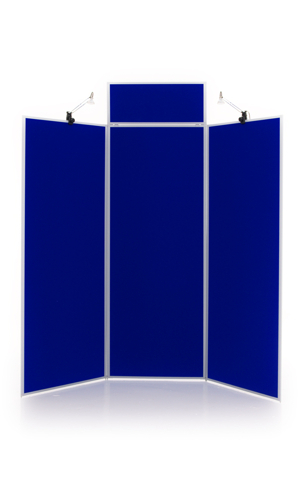
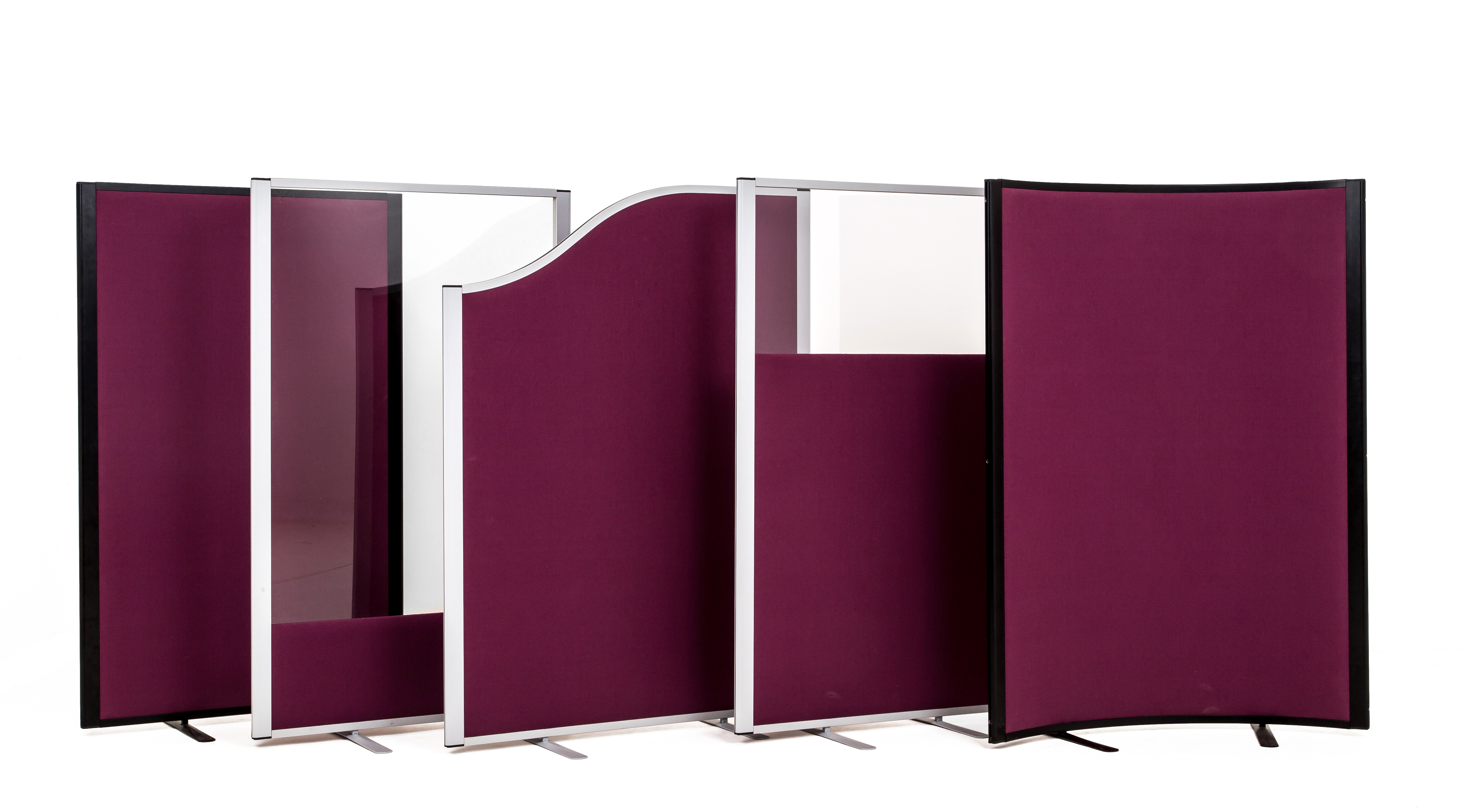
If you are in need of display boards, then here at Rap Industries, we design and manufacture high quality displays for clients from a variety of industries. From folding display boards to more permanent designs, we can create a display stand which brings out the best in your content. For more information, please have a look at our site, call us on 01733 394941 or send an e-mail to sales@rapind.com.
Display Boards

Categories
2016 Blogs

Why Exhibiting Does Not Have to Be a Waste of Money

A Riposte to Criticism Towards Trade Shows

In recent years, there have been more and more articles springing up, warning against the perils of trade shows and how they are going to destroy your finely balanced budget. They speak of how wonderful inbound marketing can be and the potential it has. Now, there is very little doubt that this kind of marketing approach is beneficial, but the idea that exhibitions should just be thrown to the wayside is a little overblown. It’s true, trade shows can be expensive, but only if you walk into it, cheque book in hand and willing to write one out to anyone who says they can help you to make it a success.

Exhibiting at trade shows is a challenge and there is no doubt about it. Those who fail and ultimately waste money are the inexperienced, newbie exhibitors who believe a fancy backdrop and a few glossy leaflets will equate to mega-money deals. The reality is that experienced attendees who have spent years on the circuit have learned about how to make a return on their fairly significant investment. For the relatively uninitiated, there are pitfalls in the exhibitions industry, however the case is the same for other forms of marketing and it is through skills and expertise that these can be overcome.

Quality Over Quantity When It Comes to Outreach

One of the major criticisms directed towards exhibiting is that your audience is limited. Even if you attend a major trade show where a few thousand people will be in attendance, this is short change in comparison to the millions which are available online. On the surface, this is true, so why then do so many businesses return to trade shows when there is a such a disparity in audience sizes compared to online? Simply put, it is because every attendee has the potential to be relevant. If you are attending the same event, then you can be sure that there will at least be some common ground for you to work from.

Online marketing can be like fishing in an ocean. Sure, there are millions of potential interested individuals out there, but being able to entice them is a significantly harder task. You can spend weeks, months or even years developing strategies to attract those 1% of individuals who actually want to do business with you. Even then when you get them through to your site, the whole deal hinges on the infrastructure you have laid down. If a page is poorly laid out, all they have to do is press that little red cross in the corner and that potential business is gone forever.

Trade shows provide you with the unique opportunity to interact with these clients, something which online marketing is still light years away from achieving. You might be a small business, but a bright idea and your passion showing through could be all that is required to secure a deal which will drive genuine growth in your business. Before you attend, arrange meetings with industry professionals you wish to meet in person. When doing business, a tweet or a short message just are not going to cut it.

Make The Most of the Experience

Exhibiting at trade shows will require you to be pro-active. If your planning consists of spending thousands on a fancy exhibition stand and then just standing next to it waiting for people to approach you, then you would be better off not attending at all. Trade shows consist of much more than just attendees milling around and chatting to stand owners. There are presentations held with leading experts in the field, meetings can be made beforehand to have a one-to-one conversation and frankly, the attendees simply do not have time to stop and chat with each stall holder.

While exhibition stands do their part to help you stand out somewhat, the crucial aspect of converting is going to come down to you and your team. There is no guarantee that everyone you talk to will be interested in your product, but having a conversation of what you do and how you do it can open up potential avenues which you may have never considered before. It is important to remember that trade shows are about much more than just sales.

Be Prepared

The biggest mistake that many businesses make which leads to a negative experience is not putting the necessary preparation in beforehand. Admittedly, it would be unproductive to commit months of your year to a single event. However, committing a large portion of your budget to an event, only to spend a few days working on your strategy is a good way to end up wasting it. At the end of the day, the style of your backdrop is not going to win you much business, so look towards large display boards, which are a much more versatile display which can then be re-used again.

Instead, commit your time and your budget to researching the event. Find out who is attending and shortlist potential businesses and clients who you think you will be able to work with. Waiting for this type of person to walk up to your stand is hardly going to harbour many results, so get yourself in front of them and pitch your ideas.

Like any kind of marketing, these methods take time and practice to perfect. Due to the up-front cost of exhibitions, it can be deterring when the first event does not go quite as planned. However, there is a good reason why exhibitions and trade shows continue to thrive and that is because there is a great deal of potential to be found. When done in moderation while you learn, exhibitions do not have to be a waste of money and can just as easily be done in conjunction with inbound marketing, rather than as a separate entity.

Trade Shows

Categories
2016 Blogs

Why Exhibiting is a Valuable Experience for ANYONE

Exhibiting Is Not Confined to Major Trade Shows

When we talk about trade shows, the obvious image which pops to mind are the corporate trade shows hosted in sprawling halls and crammed with companies both big and small. These types of events have generated a bit of a bad reputation in recent years for being a waste of money. Admittedly, this is the case for some. However, exhibiting is not just about throwing your budget at a stylish exhibition stand just to feel good and pat yourself on the back for a day. Exhibitions come in all shapes and sizes and some of the most valuable do not require an ego-boosting and overly expensive display stand.

Think Small:

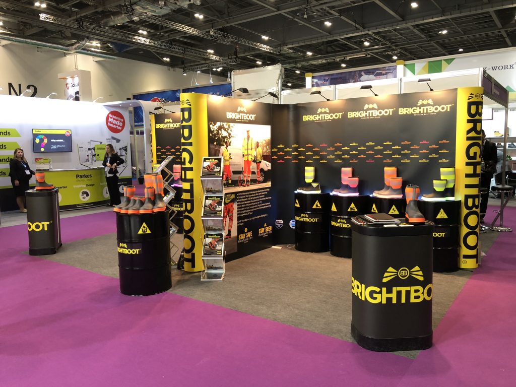
For smaller businesses in particular, with stricter budgets and more tangible goals in sight, it is important to note that there are such things as exhibitions which are not your stereotypical trade show. Look locally for craft fayres, gatherings of local businesses and networking opportunities. While trade shows are prone to becoming a ‘who has got the biggest and best stand competition’, smaller events are geared towards making sales and creating partnerships which will last beyond the evening meal. In a smaller setting, you have more time to interact and ultimately, everyone has the same goal; they want their business to grow.

Larger events can become a bit of a frenzy without careful planning, which is another area where businesses are prone to leaking potential revenue. If you are just starting out with this whole networking and building relationships business, then starting small is always the way to go if you want to learn and actually make it a success. Plenty of new exhibitors make the mistake of reading a few guides, looking at a few photos and then deciding they’re ready to throw themselves in at the deep end. Is it any wonder then that some exhibitors walk away from these events disgruntled and complaining that they wasted their time?

Build on Success:

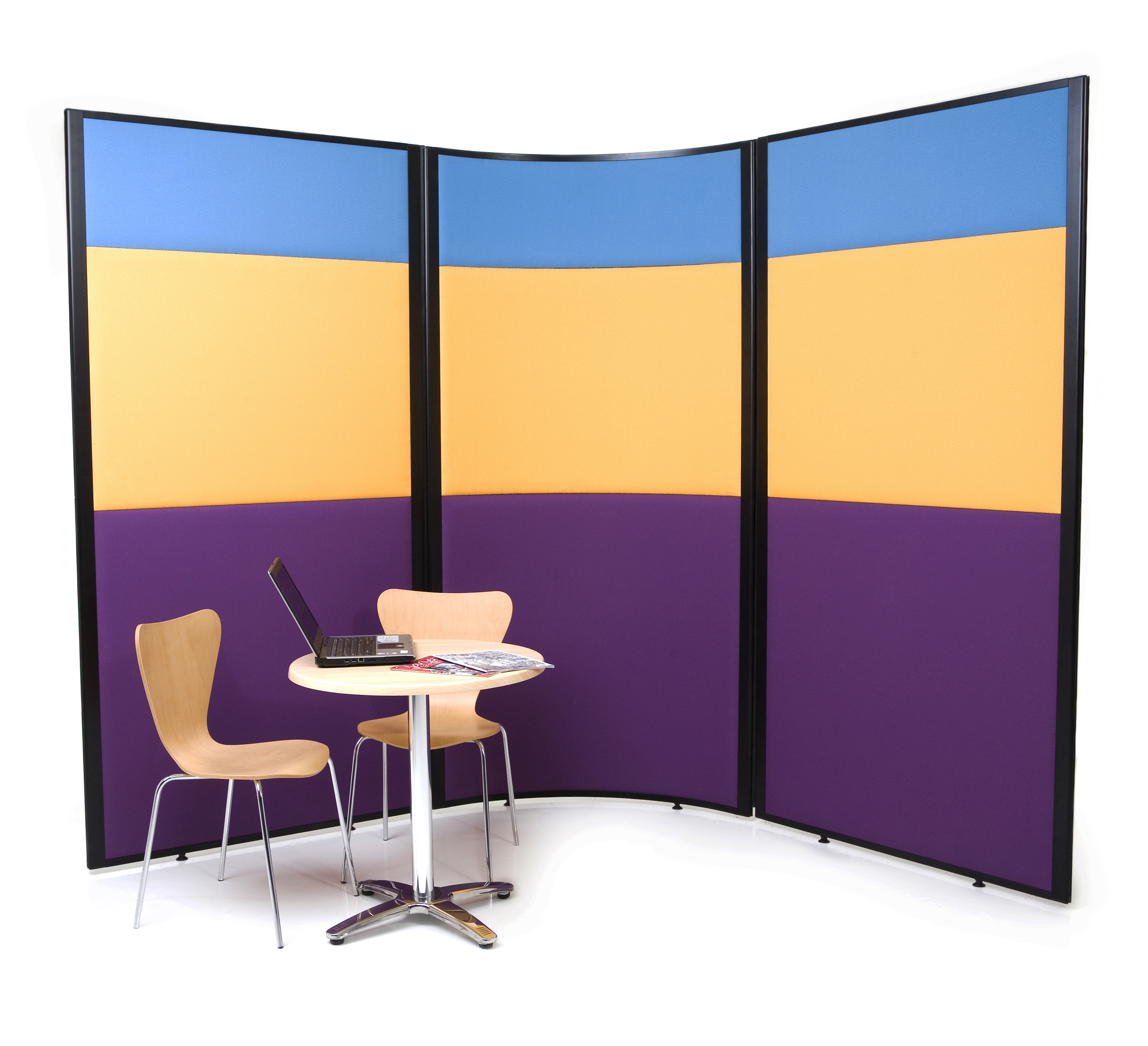
If trade shows and exhibitions are your ideal location, then you need to learn how to find value in the little things first. Fayres and conferences might not bring in that multi-million-pound deal, but they provide the opportunity to hone your sales patter and get genuine feedback from people who are not just going to palm you away. Perhaps the biggest benefit is that you do not need to invest thousands for a high-spec exhibition stand which you end up using once or twice a year. Display boards and banner stands are just as effective in smaller situations and at a fraction of the cost.

Often with large exhibitions, while they may be relevant to your industry, that does not guarantee that everyone will hold something in common. It is true that thousands of people may be in attendance, but if only a small percentage (and there is no way to get an exact number) who attend are interested in your products and services, then the opportunity to see a return on your investment is severely diminished. Smaller events are often much more focused and assuming you pick out the right one, that percentage of interest parties is likely to be significantly higher. While you may not find that big fish you were hoping for, there is far more potential to make smaller and more frequent gains. Combine this with a cheaper investment and this kind of exhibition experience is more likely to be worth your time and money.

Time is Equally as Valuable as your Budget:

As any small business owner can appreciate, while the budget is always a factor in decisions such as these, time is often more valuable. Large exhibition stands can take weeks or even months of preparation and that can consume valuable hours, days and weeks of your time preparing for an event which you may not even see a return on. As much as fayres and local events still require preparation, they allow you to maximise your efforts in other areas while still committing enough time and effort towards the event.

Afterwards, if your approach has been a success, then it can be picked up and implemented with a new event in the upcoming months. A few adaptations with what you have learned here and there and before you know it, exhibitions are not quite as time consuming as you had originally thought. As an added benefit, you will not even need a new display. Banner stands and display boards are designed to last and their compact design means they can be neatly tucked away in a storage cupboard until they are needed again.

Be Smart and Exhibitions Can Be an Extremely Worthwhile Venture

If you were to attend a large exhibition and ask what their key to success would be, chances are their response would be something along the lines of ‘try and try again’. Much of the disillusionment associated with exhibitions stems from new attendees with only a hint of what they are supposed to be doing seeing all their effort return very little in the ways of results. Top exhibitors have been doing this for years and will continue to do so for many more to come as they have been able to understand what is required to make the experience a success. Rather than throwing all of your eggs into one basket; start out small and learn how to schedule events such as these. The returns may not provide a huge boost for your income, but they can open up new opportunities and avenues for your business to grow.

At Rap Industries, we have been working with clients both big and small for over 40 years, so we have gathered invaluable experience in how clients make their exhibition a success. If you are looking at a more cost-effective display stand for your exhibit, then have a look at the Large Display Boards or visit our site for a wider collection. Alternatively, you can get in touch by calling 01733 394941 or send an e-mail to sales@rapind.com.
Exhibition Stand at Tradeshow


Notice: ob_end_flush(): Failed to send buffer of zlib output compression (0) in /home/godispla/public_html/rapind.com/blog/wp-includes/functions.php on line 5427